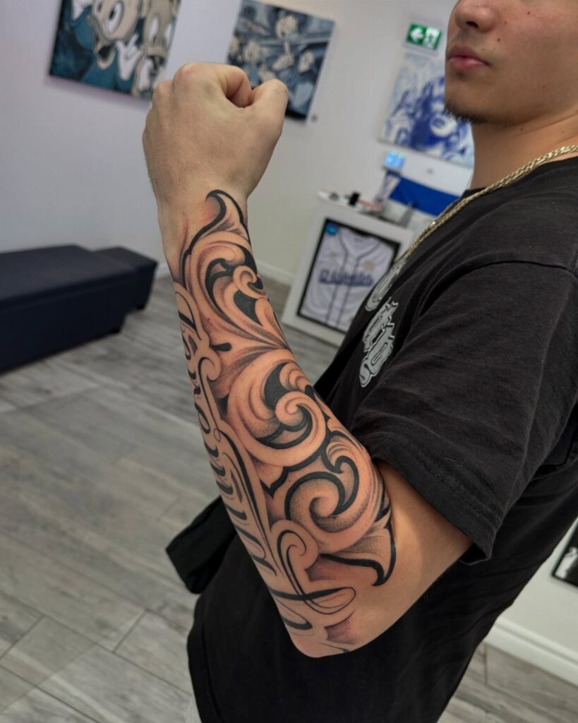
Filigree tattoo designs for men run from a single-session forearm scroll to a multi-session chest piece demanding loose shirts through healing. The list below covers placement and complexity both, so you can match size to spot before you book.
Your own pain tolerance and willingness to explain the work to strangers decides which placement is yours: the outer forearm stays hidden under sleeves, while the neck shows in every collar.
The placement considerations section breaks down what healing each spot actually looks like. Black and grey ink is the standard, and the fine line-weight work that makes scrollwork read as lace rather than mud relies on value shifts, not color.
[link-whisper-related-posts]1. Swirling Acanthus Leaf Patterns
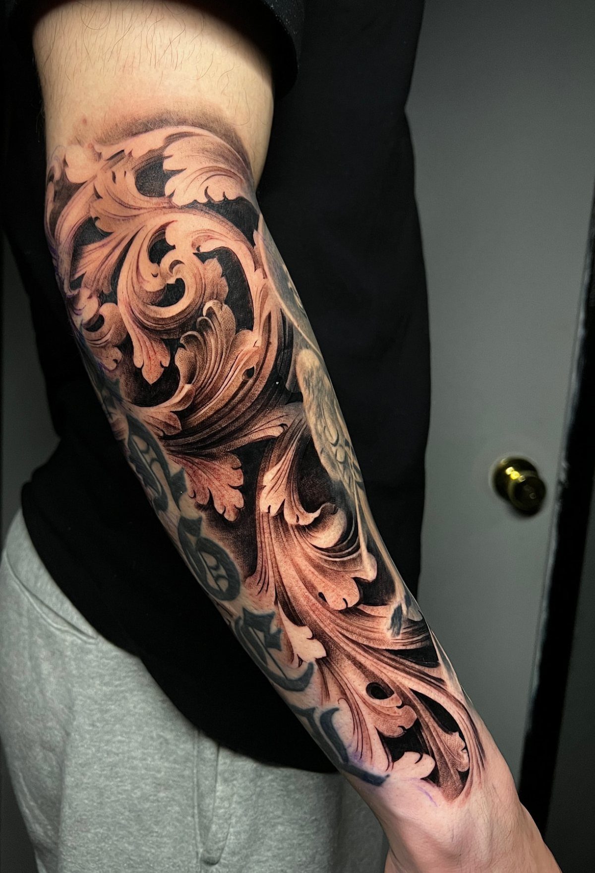
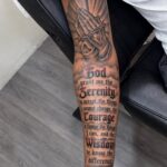
Acanthus scrollwork builds a sleeve that moves with the arm rather than fighting it.
The leaves curl around the elbow and forearm in one continuous flow, which means your artist needs to map the design while you stand with your arm relaxed at your side, not stretched flat on a table.
I would ask for the darkest leaves to sit on the outer forearm where the sun hits most, since that skin sees more fading.

REUSABLD VARIETY OF OPTIONS - This set of temporary tattoo stencil includes 123 different patterns for adult,male. Scorpion tiger dragon cow eagle skeleton Tribal Symbols geometric design etc patterns in 20 pages A4 size, Almost unlimited creative combinations and options to meet your every need.

Product Kits: 7 A4 sheets featuring 73 unique stencils for tattoo stencil including butterflies, flowers, words, symbols, totems and Egyptian designs. Our versatile temporary tattoo collection offers something for every taste with its wide variety of artistic models

Product Kits: You will receive 12 A4 sheets featuring 142 unique henna tattoo stencils patterns including butterflies, flowers, words, symbols, totems and egyptian designs. Our versatile temporary tattoos adult with stencils collection offers something for every taste with its wide variety of artistic models.
2. Ornate Skull Tattoos
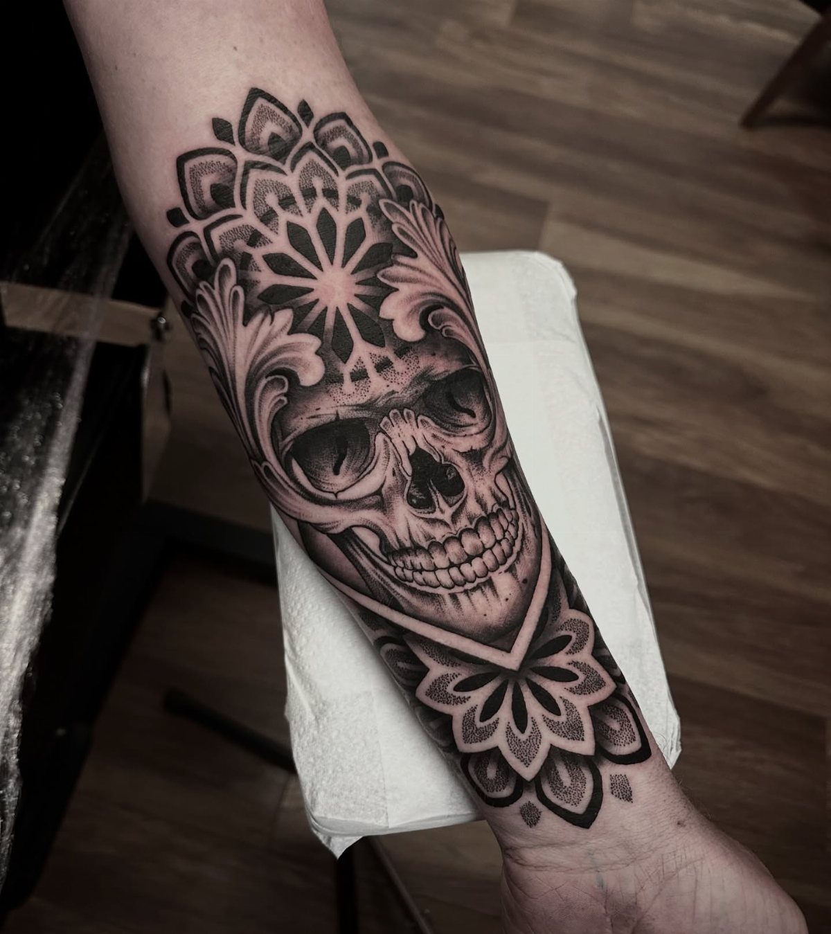
Skulls wrapped in filigree read differently than skulls alone: the scrollwork softens the image without weakening it.
Black and grey ink keeps the focus on the contrast between the smooth bone and the busy leaves, letting the filigree do the work without extra color.
A realistic skull takes serious time just for the shading, so budget for 2 sessions if your artist works in half-day blocks.
A mandala dotwork frame sits flat against the inner forearm, which is a painful spot but heals cleanly with less sun exposure than the outer arm.

★【6 Pieces/LOT】--COKTAK Brand Temporary Tattoos Sticker in package.【Size】: 20x15CM 7.8"x5.9"

🐙4 Sheets Unique Groovy India Black Temporary Tattoos Sticker:🐠 There Are 4 Sheets Tribal Temporary Tattoos For Women Adults 21x15cm 8.2"x5.9" Including Various Popular Designs Round Lace Hands Boho Bohemia Geometry Lotus Mandala Flower Florals Tatoos Stencils Template.

High quality fashionable temporary tattoo, which looks like real
3. Portraits with Filigree
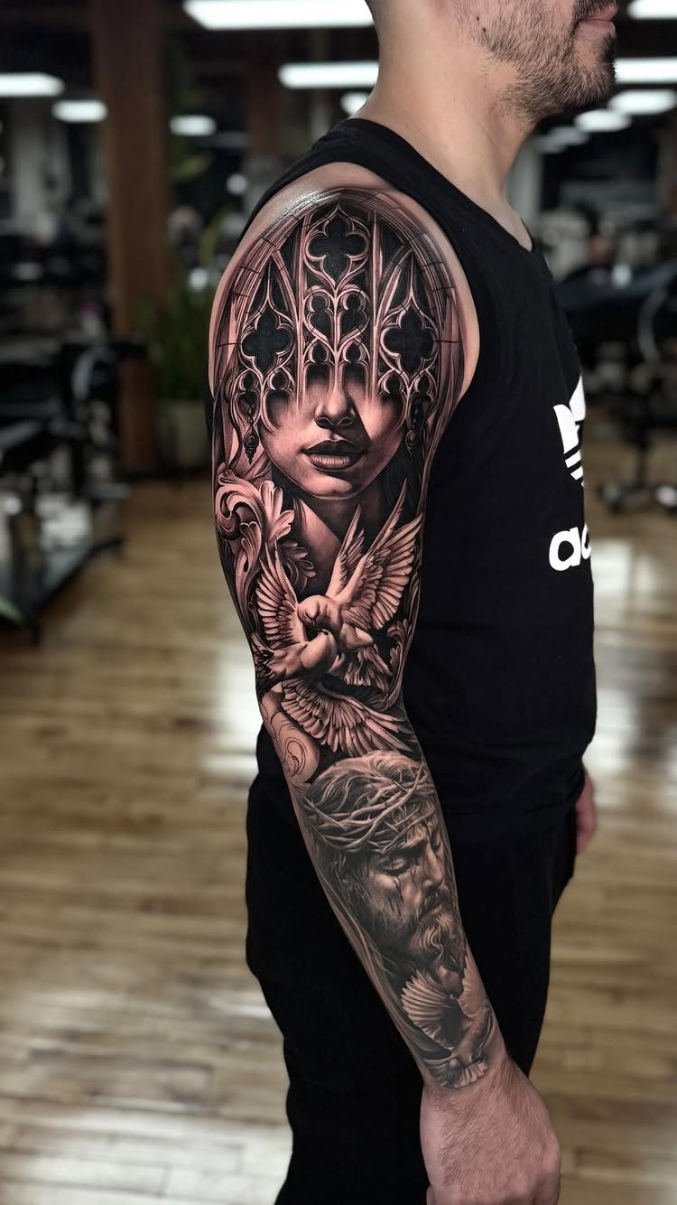
A portrait needs room to breathe, and filigree can either frame it or smother it.
A good sleeve keeps the face as the clear center, with the gothic scrollwork filling the gaps around doves and secondary figures rather than competing for attention.
Black and grey ink is the safer choice for faces; color portraits fade unevenly and the touch-up becomes a partial redo.
Your artist should stencil the portrait first and build the filigree around it, not the reverse, or the proportions will slip.
I prefer the scrollwork to stay lighter in value than the face itself so the hierarchy stays obvious from across a room.

Dopetattoo Waterproof High-Quality Easy-Use Long-Lasting Temporary Tattoos.You can take it to the beach, swimming pool, bath and any other water activities. Without excessive friction. It will last 3-5 days.

ABUNDANT QUANTITY: Our Day of the Dead sugar skull tattoos costume,Halloween sugar skull temporary face tattoos, include 20 sheets, 2 different styles, Including 8 large sheets halloween temporary face tattoos, measures 21*15cm(8.3*5.9inch), and 12 sheets sugar skull tattoo, measures 6*6cm/(2.4*2.4inch), sugar skull makeup kit, day of the dead skeleton face temporary tattoo, enough to share with friends
You will receive 25 sheets totally 100pcs in 20 different designs day of the dead skeleton face temporary tattoo face kit, black white blue pink brown gold silver fluorescence multicolor apply in to create more interesting experiences and celebrate life! each pattern measures 4.6*4.6cm/ 1.82*1.82inch , one size fit all girls boys kids Women Men Adult and Kids
4. Filigree and Clock Tattoos
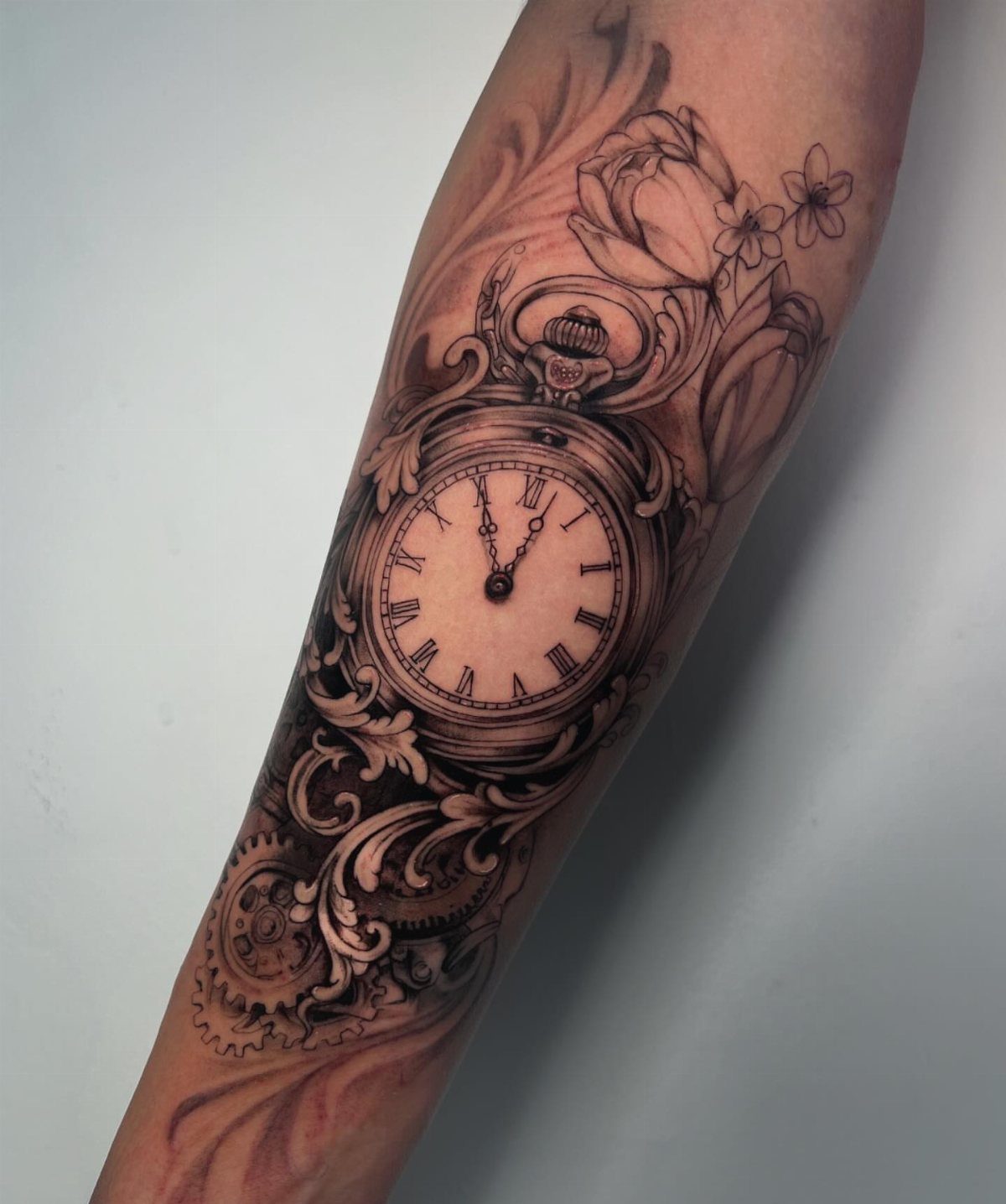
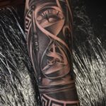
Clock tattoos carry the usual meanings about time and mortality, but the filigree surrounding them is what separates a generic pocket watch from something worth wearing.
Gears and scrollwork can extend a clock face into a half-sleeve that reads as one piece rather than a watch with decoration bolted on.
The numerals and hands stay in black and grey; if you want color that subtle, ask your artist to use a lighter shade than looks right in the bottle, since it darkens as it heals.
Roman numerals work better than Arabic for this style, their straight lines balancing the curves of the filigree.

Realistic Finish: Different from you know ordinary temporary tattoo stickers or fake tattoos. It is so real and comparable to the real tattoo. It is a semi-permanent technology, Water-Resistant, friction-resistant, and can last for a long time, staying on your skin for 1-2 weeks.

- Easy Application in Minutes Cut out the design, peel off the clear film and place it face down on clean, dry skin; keep it still, soak the backing with water, press for 30 to 40 seconds, then lift the paper gently from a corner.

Gothic Design – Features cross and vintage clock designs with spiritual symbolism, a perfect match for body makeup, Halloween costumes, and gothic cosplay.
5. Religious Filigree Chest Pieces
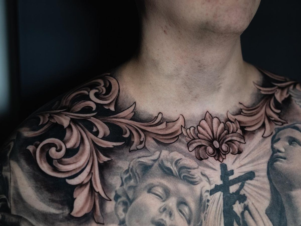
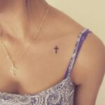
The collarbone and upper chest give filigree its full effect: the natural lines of the body echo the scrollwork rather than cutting across it.
Heavy black shading along the collarbone anchors the design, while softer grey gradients let the religious figures below read clearly against the busy background.
White highlights, used sparingly, lift the cherub and cross forward visually; too much white and the piece looks like a photograph rather than a tattoo.
This placement hurts more than the arm, especially where the needle crosses bone near the sternum, and the healing period demands loose shirts for a while to avoid rubbing.
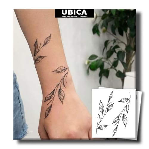
【Natural & Skin-Friendly】Made with plant-based extracts and free from harsh chemicals, UBICA semi permanent tattoos are gentle on all skin types—even sensitive skin. Express yourself without irritation!

SYMMETRICAL BOTANICAL SPRIGS: Features a beautifully balanced pair of curved minimalist olive branches, showcasing alternating tapered leaves and fluid woody stems. This botanical set is crafted using a digital hand-drawn fine line tattoo ensures crisp lines and flawless gradient shading to deliver precise flowing curves, delicate stippled vein details, and elegant organic symmetry that mirrors natural foliage.

Innovative Skin-Sync Technology: We don't just sit on the skin; we interact with it. By reacting organically with naturally occurring proteins in your skin's outermost layer (stratum corneum), our plant-based formula magically transforms from a transparent guide into a rich, ultra-realistic navy-black. It looks exactly like a healed, permanent tattoo—without the needles or depth.
6. Color Animal Filigree Tattoos
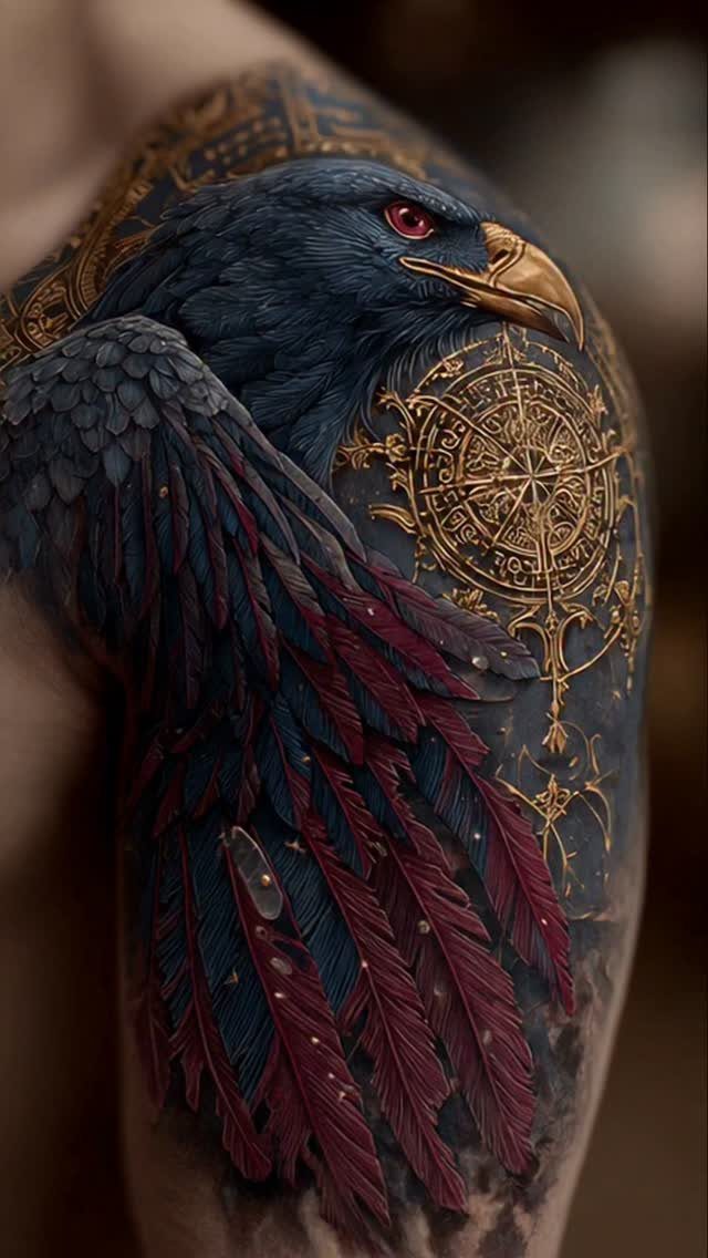
Gold filigree on a color bird is not metallic ink; it is yellow and brown tones shaded to catch light like gilding.
The scrollwork can carry the color while the bird itself stays in dark blue and red, so the filigree reads as ornament and the bird as subject.
That balance matters: if the gold spreads too far, the eye has no place to land.
Watercolor-style backgrounds work behind filigree, but only if your artist has healed photos of that combination on skin, not just fresh work. I would check their portfolio for older color pieces, since watercolor fades faster than traditional saturation.

【 What's included 】- 12 pages of unique and strong adhesive tattoo stencils, (no pigment included): (including 12 A4 patterns sheets) Almost unlimited creative combinations and options to meet your every need.

【 761+ Fun Assorted Tattoo Stencils 】-The ChurlChurl tattoo stencils collection includes 761 high quality stencils with multiple themes. enjoy cute trendy tattoo stencil designs like butterflies, words, flowers, symbols, totem, Egypt style patterns and more.

▶ Henna Tattoo Kit: 16 sheets tattoo stencils. airbrush tattoo stencils suitable for tattoo lovers. Experience the effects of tattooing without the pain of tattooing.
7. Filigree with Roman Numerals
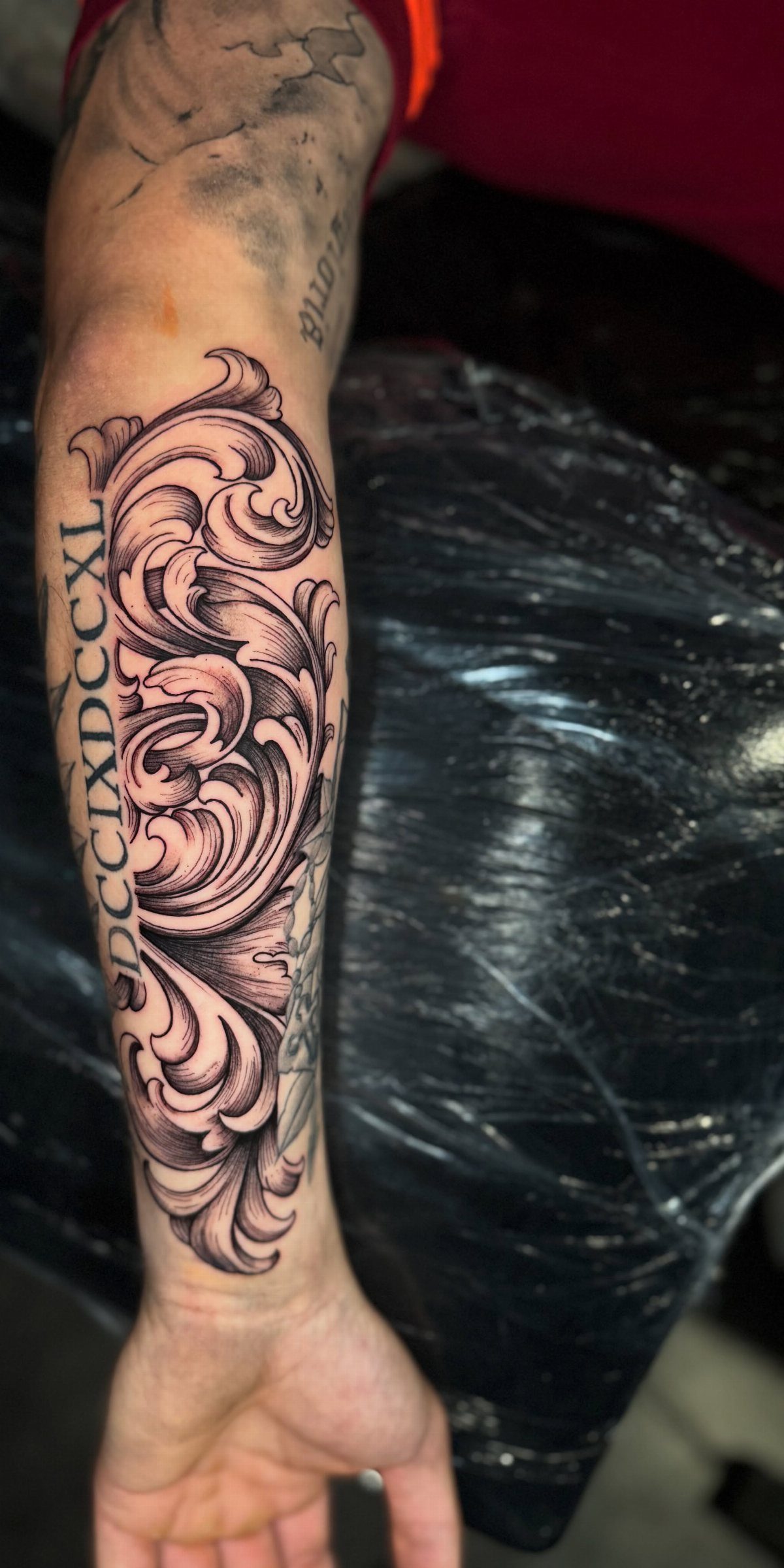
Roman numerals give filigree a straight spine to wrap around. A vertical column of filigree running from wrist toward elbow lets the scrollwork grow denser as it moves upward, so the eye travels the full length of the arm.
I would keep the numerals in solid black and let the filigree carry the grey wash; if both elements compete in value, the date becomes decoration and the decoration becomes noise.
The letters "DCCIXDCCXL" read as pattern from a distance and text up close, which is the right trade for a forearm piece seen at both ranges.
Ask your artist to stencil the numerals dead straight while you stand; skin shifts when you sit, and a vertical line that looks right on the table drifts once you stand.

🌼【VARIETY OF POPULAR PATTERNS】Brand FANRUI 300+ PCS 15 Sheets High Quality Mixed Style Black Smll Temporary Tattoos For Hands Feets Including Realistic Lovely Cute Tiny Infinity Butterfly Dragonfly Bow Bowknot Heart Planet Star Sun Crescent Moon Rose Skull Lip Snake Flower Temporary Tattoos For Women Men Adults Tattoos For Finger Hand Neck Ear.

💕【64 Sheets Black Temporary Tattoos For Women Girls】--VANTATY 3D Realistic Temporary Tattoos For Adults Women Kids Adults Girls Body Art Stickers Look Real! 【Click Our Store/Brand Name To See More Fashion Designs】Tribal Lion Wolf Indian Feather Lotus Butterfly Bohemia Boho Lotus Mandala Flower Floral Animals Elephant Tattoos Dreamcatcher Serpent Dream Catcher Owl Moon Turtle Hummingbird Skull Skeleton Snake Bat Bowknot Dolphin Moon Crown.
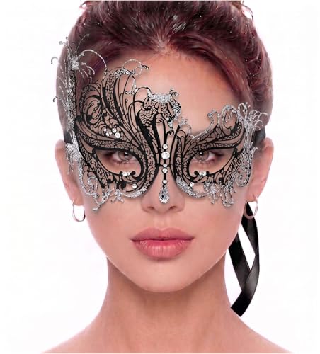
SWAN STYLE FILIGREE LASER CUT METAL MASK: This Swan Style Metal Masquerade Mask for Women is intricately designed with a beautiful swan-style pattern. The metal material of the mask is expertly cut with laser technology, resulting in intricate and precise detailing of the pattern. The Swan-style pattern of the mask adds an elegant touch to the overall design, making it the perfect accessory for any masquerade-themed event
8. Chess Piece Filigree Neck Tattoo
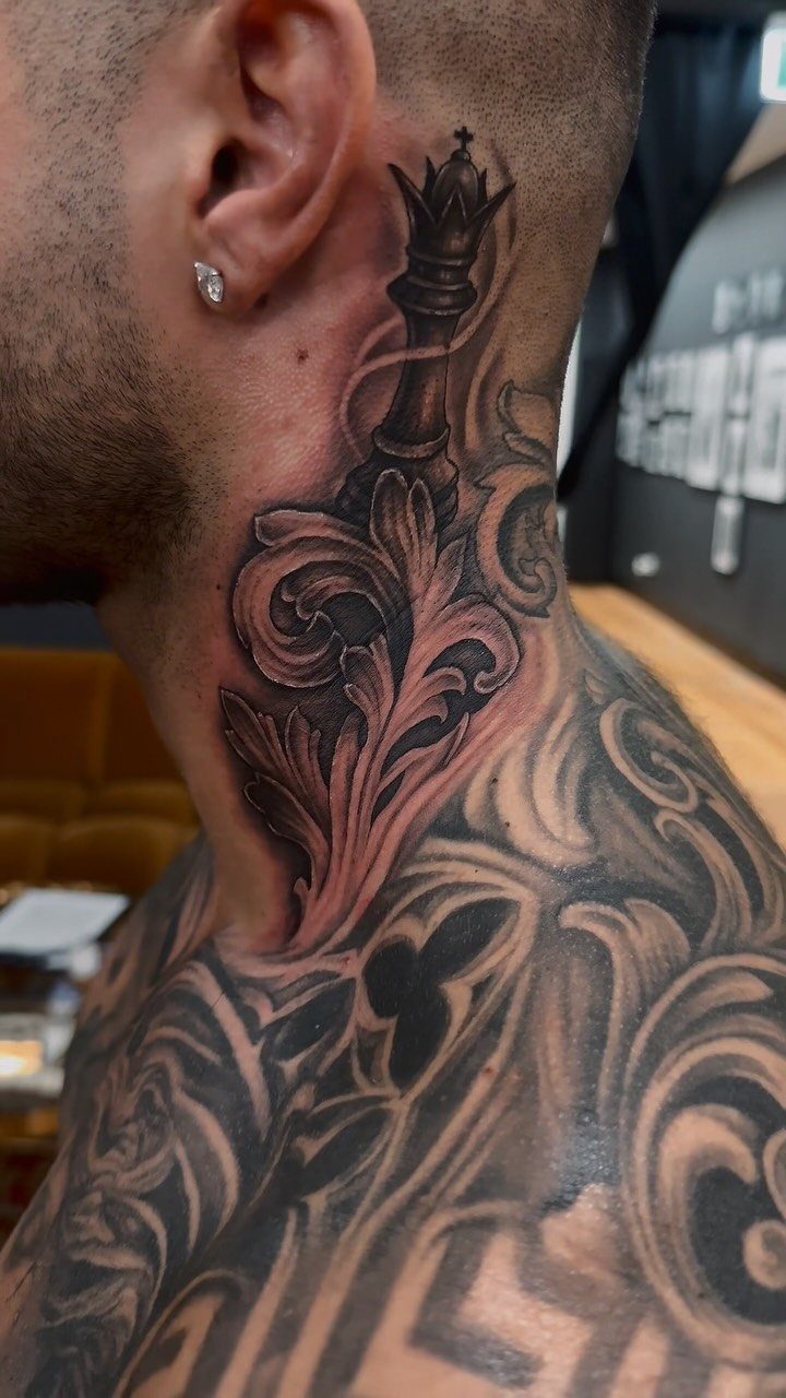
The neck offers filigree no flat canvas, so the scrollwork has to climb the slope from collarbone to jaw. A chess king piece rising from acanthus leaves gives the design a center of gravity; without it, the scrollwork would float.
White highlights on the crown catch light when you turn your head, but I would keep them minimal; too much white on neck skin blurs as the area moves and heals.
This placement shows in every shirt collar, so the king should mean something you still want to explain long after you get it.
The pain near the jaw and collarbone is sharp, and healing demands loose necklines until the scabs settle enough to stop catching on fabric.

8 Floral Sugar Skull Sheets: 8 sheets of Dia de Muertos face tattoos with floral sugar skull designs, each 7.4x6.3in/18.8x16cm - elegant calavera art for women, men and teens.

4 Realistic Skeleton Hands – Set includes 2 left-hand and 2 right-hand bone designs for ultra-creepy Halloween transformations.

Spooky Halloween Set – 6 sheets with skull face, skeleton hand, snake, and collarbone designs for a chilling costume transformation.
Color Preferences
Black and grey ink is the standard for filigree work, and for good reason.
The fine lines and cross-hatching that give scrollwork its depth rely on value shifts, not hue, and black ink holds those gradations longer than any color on the market.
Gold and sepia accents do show up in some designs, but they function as highlights rather than fields.
If you want that gilded look, ask your artist to show healed photos of their gold tones; the yellows in metallic ink fade fast and some never settle to the tone you saw in the stencil.
Yellows fade fastest in the palette, and a filigree piece that depends on its gold will look like a different tattoo after 2 summers of sun.
I would not build a whole filigree design around any single accent color; the scrollwork itself is the point, and color should serve it rather than compete.

Silent Non-Ticking Movement: Enjoy a peaceful environment with this clock featuring a quiet, non-ticking mechanism that allows for restful sleep.

【Realistic Semi-Permanent Look】Boldink temporary tattoos are designed to look more like real tattoos than traditional temporary tattoo stickers. They are waterproof, smudge-resistant, and non-shiny for a natural-looking finish. The tattoo will appear silver at first and gradually darken into a rich, realistic color within 48 hours. For best results, avoid contact with bare skin, especially the face, and cover the tattoo with clothing while sleeping to prevent transfer.
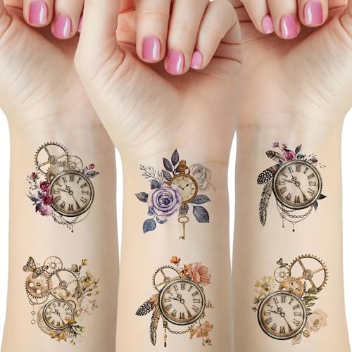
- Easy Application in Minutes Cut out the design, peel off the clear film and place it face down on clean, dry skin; keep it still, soak the backing with water, press for 30 to 40 seconds, then lift the paper gently from a corner.
Placement Considerations
The arm dominates filigree placement for a reason: it offers length without the structural challenge of the torso.
The outer forearm sees more sun than the inner, which matters for black and grey work because UV fades the lighter grey washes first, leaving a piece that reads as darker and heavier over time.
White highlights in chest pieces lift visually because the skin is lighter there than on sun-exposed arms, but the same movement and healing challenges apply.
The neck is the most visible placement and the least forgiving.
Every shirt collar will show the work, and every conversation will include it. I would not put a design there unless the meaning holds up to daily explanation.

[Semi-Permanent, Realistic Tattoos] INKARTLINK semi-permanent tattoos are lifelike, durable, waterproof, and sweat-resistant, lasting 7–14 days and gradually fading as the...
Design Complexity
Filigree work is line-weight work.
The difference between a scroll that reads as lace and one that reads as mud comes down to how many weights of black the artist can lay down: hairlines for the tendrils, mid-weights for the leaf bodies, and solid blacks for the anchors and shadows.
An intricate piece needs all three, and an artist who defaults to one weight throughout will flatten the design no matter how detailed the stencil.
Heavy black shading and soft grey gradients are the tools, not the goal. The contrast between them creates depth, and white highlights add a third plane when used sparingly.
Too much white, especially in chest or neck pieces, pushes the image toward photographic rather than ornamental; the eye reads it as highlight rather than form.
The elbow and forearm move, and a design that looks balanced on a flat table will bunch and stretch when the arm bends.
I would rather see a design simplified to fit one clean session than compressed into a single sitting that leaves the filigree half-finished.