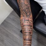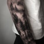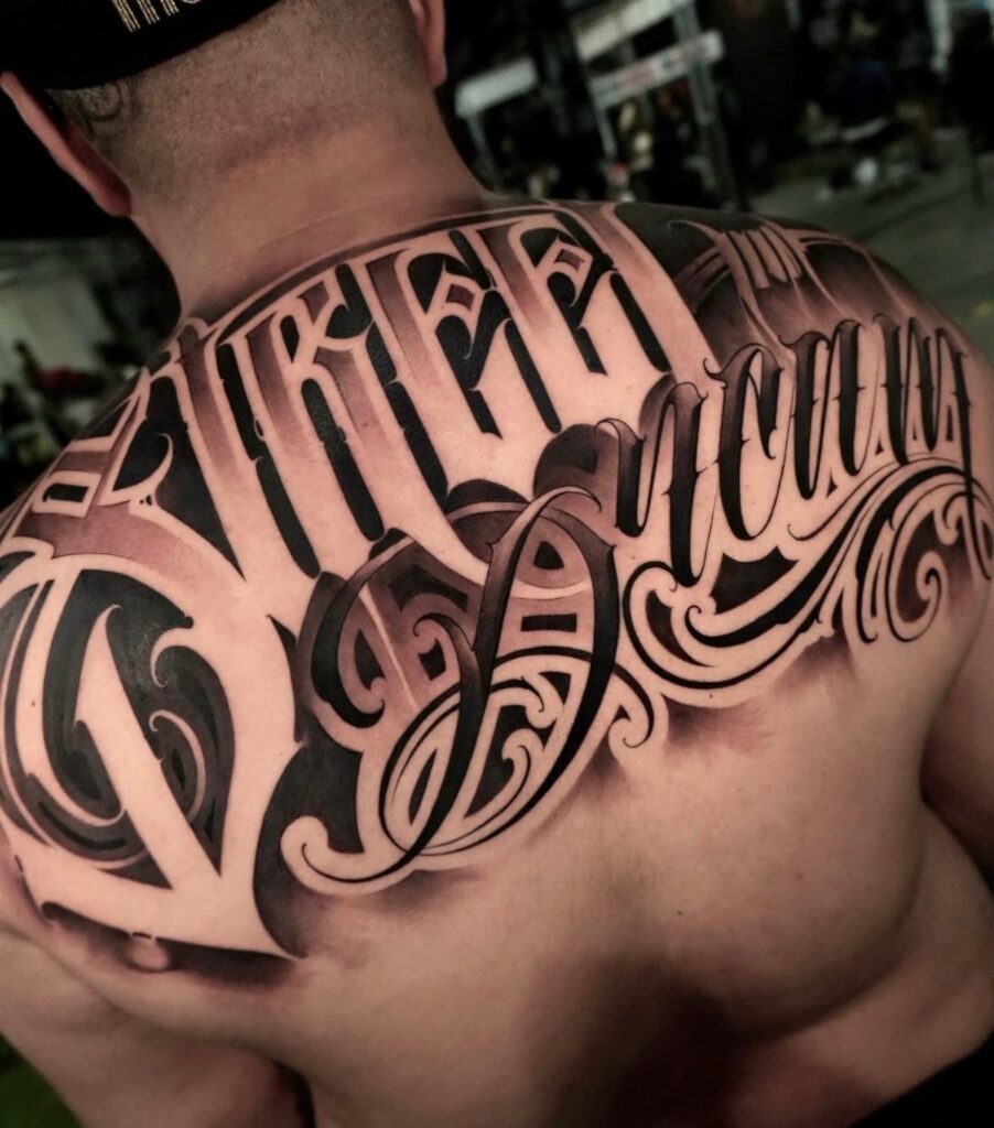
Large back script tattoos come in several distinct forms: vertical flowing script that follows the spine, large cursive lettering that fills the upper back, dedicated spine tattoos, gothic upper back script with its heavy blackletter forms, and filigree and flourished script that wraps ornamental detail through the letters.
The deciding factor is how much movement your chosen placement sees: upper back skin stays relatively still while lower back skin shifts with every step and sit.
Checking the stencil while standing, sitting, and bending forward catches the distortion that ruins lettering before it is permanent.
[link-whisper-related-posts]1. Vertical Flowing Script
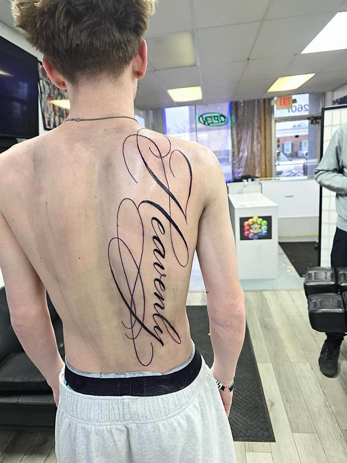
A vertical script tattoo follows the spine’s natural curve with black ink calligraphy that varies between thick downstrokes and hairline upstrokes.
The lettering reads as one continuous ribbon rather than stacked words, which keeps the eye moving and the back looking longer.
I have seen this style work best when the word or phrase holds enough letters to fill the space without crowding; shorter words get lost, longer ones start to crowd the shoulder blades.
The flourishes that extend from ascenders and descenders should be drawn on while you stand straight, then checked again while sitting, since the spine compresses and the spacing changes.
Plan for multiple sessions if the piece extends past the shoulder line toward the lower back.

1 Set = 12 Sheets Henna Tattoo Stencils, 6 Pairs Right and Left hands stencils. Pasting position: Hand, Finger,Forearm, etc. Suitable for Henna tattoo, Airbrush Painting, Glitter tattoo, and so on;

24PCS Unique Henna Stencil Pack – This complete henna tattoo kit accessory set includes 24 sheets of reusable mehndi stencils (6.89" x 3.34"). Featuring exclusive designs like long arm bands, moon motifs, vine flowers, and large floral templates, it is ideal for creating DIY temporary skin art on wrists, arms, back, and full body.

Product Kits: You will receive 12 A4 sheets featuring 142 unique henna tattoo stencils patterns including butterflies, flowers, words, symbols, totems and egyptian designs. Our versatile temporary tattoos adult with stencils collection offers something for every taste with its wide variety of artistic models.
2. Large Cursive Lettering
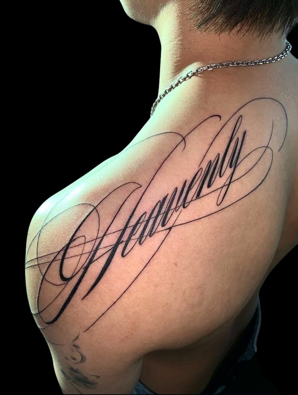
Large cursive lettering across the upper back and shoulder reads from a distance the way a billboard does: the loops need to stay open, the counters need to stay clear.
What looks elegant up close can turn to black soup from across the room if the line weight stays too fine.
The shoulder placement means the tattoo moves when you move, which is half the point. A word like "Heavenly" with its ascending H and descending y gives the design natural symmetry to build around.
I would ask the artist to draft the piece on paper at full size, then tape it to your back and walk across the room; if you cannot read it, neither can anyone else.
Healing on the upper back is straightforward if you sleep on your stomach for a while, which is harder than it sounds.
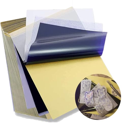
Standard size: Tattoo Transfer Paper is standard A4 paper size, each measures 8.27 in X 11.69 in. There are 4 levels in total. The thickness of the paper is very light and smooth to the touch.
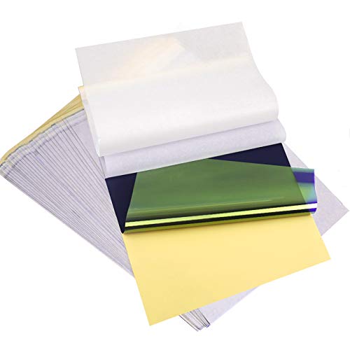
ADVANCED MATERIAL: Tattoo transfer paper is made with the high quality dyes and stencil paper. Transfer marks are very clear, clean and smooth. Tattoo transfer paper kit come with 35 sheets. Great for tattooing, trace and transfer images onto the body.<br>

Crystal Clear Transfer & Stable Stencil Effect : Our KVM transparent tattoo stencil film delivers sharp, clean printed lines. The pattern transfers perfectly onto skin, not easy to smudge or wipe off after application. It works great for intricate mandalas, skulls, portraits and line art.
3. Spine Tattoos
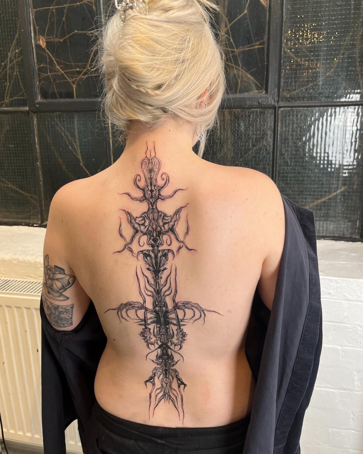
Spine tattoos borrow from 2 traditions that do not usually meet: the vertical column of Japanese irezumi and the single-line minimalism of modern fine-line work.
The result is a design that draws the eye up and down, emphasizing posture in a way no other placement does.
Floral stems or script both work here because the spine gives a natural centerline to build from.
The skin along the vertebrae is thin and the nerves run close, so sessions tend to be short and numbing options worth asking about.
I have noticed that botanical designs age better than script on the spine; the straight lines of lettering blur where the skin flexes, while organic shapes forgive the distortion.
A piece that starts at the neck and runs to the tailbone will need touch-up eventually, plan for it.

Realistic Gothic & Y2K Tattoo Collection:Designed with highly detailed temporary tattoos realistic artwork inspired by gothic, punk, grunge and Y2K aesthetics. Create bold looks with fake barbed wire tattoos, wicked tattoos, No Ragrets style lettering, Dark Angel, Broken Halo, wings, hearts, butterflies, snakes and tribal tattoos. Perfect for both temporary tattoos adult women and temporary tattoos men.

【Black Flower Chest Temporary Tattoos for Women】A pack of 10 sexy and fresh tattoo stickers with different patterns, each size is 5.43*9.44 inches, including mandala flower branch butterfly tattoo stickers, which look sexy and mysterious,perfect for girls who want to try a fresh tattoo style.

EMBRACE THE MACABRE: Coffins, bats, and skulls... oh my! Inside this Gothic Temporary Tattoo box, you'll discover a diverse collection of 25 darkly-inspired designs
4. Gothic Upper Back Script
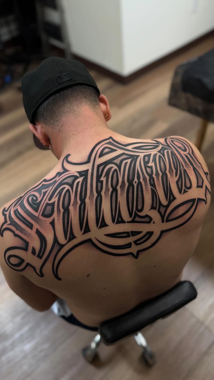
Gothic script across the upper back carries weight in the literal sense: heavy black fill, sharp serifs, and shadowing that reads as carved stone rather than written ink.
The style suits broad shoulders because it needs width to open up those angular letterforms; on narrow builds the letters compress and lose their architecture.
Keeping the tattoo entirely above the shoulder blade line is the safe zone for this much solid black.
Below that, the scapula movement starts to break edges. I would bring reference for the specific gothic variant you want, old English and textura and fraktur are 3 different dialects and most artists default to whichever they learned first.
Shading this dense means longer sessions and a higher bill, but the result holds its contrast for decades.
Sumi Ink for Traditional Asian Brush Art: This 3.5 fl oz (100 mL) bottle of black liquid ink is ready to use for Chinese calligraphy, Japanese brush painting, and ink wash artwork on xuan paper or rice paper.

♥MATERIAL: 12 colors of ink provide vibrant effects for creation. The ink can be easily cleaned with water, allowing quick color switching during use.

Authentic Sumi Ink: Experience the rich, velvety texture of traditional Chinese calligraphy ink, perfect for creating stunning artworks.
5. Filigree and Flourished Script
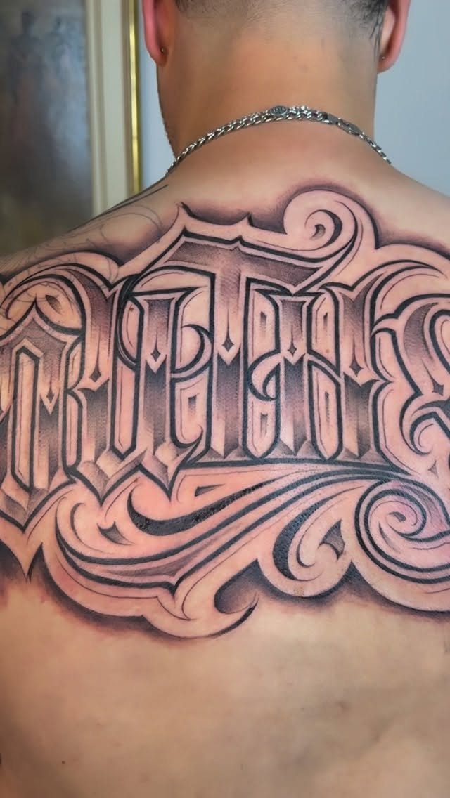
Filigree framing turns script into ornament: the lettering becomes the center of a mirror, and the flourishes extend outward like wrought iron.
The upper back and shoulders give the canvas this style needs; spread the piece wide enough that the negative space between scrolls matters as much as the ink.
The risk is clutter. I have watched artists save a too-busy design by removing half the filigree and letting the script breathe; the version you wear should be the simplified one.
Ask to see the stencil without the black fill, just the linework, and check that each swirl has a clear path that leads the eye back to the word.
Ornamental tattooing demands an artist who specializes in it; the line consistency required for matching scrollwork on both sides is not a general skill.

★【16 Sheets Realistic Floral Proverb Words Temporary Tattoos For Women】--COKTAK Brand Vintage Black Mixed Style Proverb Words Tattoos. Package Includes 16 Sheets Realistic Waterproof Planet Lily Lotus Sunflower Rose Butterfly Floral Chains Tattoos Proverb Words Quotes Letters Tattoos Flower Chains Temporary Tattoo Stickers.

Massive Quantity: 60 Sheets removable temporary tattoo stickers, including 30 pcs of inspirational and motivational quotes and scripts, cursive words, meaningful sayinging and writings, 30 pcs of simple minimalist flower tattoos. Enough choices for friends outing, party gatherings to enjoy together or choose different tattoo designs to match your everyday mood.

✔[LONG MOON FLOWER TEMPORARY TATTOO] Briyhose Black Long Moon Sun Flower Temporary Tattoos Can Cover Your Body Parts Large. It Contains 10 Sheets 9.45 * 2.95 Inch (24 * 7.5cm) Realistic Black Lotus Moon Floral Fake Tattoo Stickers For Adults Girl Women Tatto Kit. You Can Share It With Your Family And Friends.
Tattoo Design Styles
Cursive, calligraphy, and fine line each handle the back differently. Cursive keeps loops open and flowing, which matters on a large scale where the eye reads from across a room as much as from up close.
Calligraphy gives you controlled variation between thick and thin, built with a flat nib or a brush; the contrast holds up under black ink but demands an artist who can pull consistent downstrokes across the full span without the line weight drifting.
Fine line looks delicate on Instagram and can work on the back if the design stays simple enough that a single hairline does not disappear into skin texture after a year.
Most artists lean toward one of these three and will steer your project into their comfort zone unless you bring reference that pins them to another.
I would ask to see healed photos of their script work at the size you want, not fresh ones; fresh lines always look sharper than they settle.

REUSABLD VARIETY OF OPTIONS - This set of temporary tattoo stencil includes 123 different patterns for adult,male. Scorpion tiger dragon cow eagle skeleton Tribal Symbols geometric design etc patterns in 20 pages A4 size, Almost unlimited creative combinations and options to meet your every need.

Package Includes: You will receive 20 sheets reusable tattoo stencils, enough quantity to meet your daily requirements. The mehndi stencils are suitable for airbrush painting, glitter tattoo, and so on.

Clean, Flawless Transfers: Your artwork will look so clean once transferred to the skin with the Stencil Stuff gel! Gentle on the skin, Stencil Stuff transfer solution helps you achieve clear and sharp tattoo stencil transfers every time!
Tattoo Placement Considerations
The spine draws a straight line down the back, but the body around it curves in 3 dimensions.
A vertical design that reads centered when you stand will drift slightly left or right when you twist, and the skin stretches differently at the thoracic spine than at the lumbar.
For side-of-spine placement, the natural curve of the ribs becomes part of the composition whether you plan for it or not.
A rigidly straight design fights that curve; one that flows with it looks intentional. The lower back skin moves more with walking and sitting than upper back skin does, which affects how script settles over time.
I would have the artist mark the stencil while you stand, then sit, then bend forward slightly. The design that stays legible through all three is the one worth committing to.
Torso placement also means your own view of the tattoo is limited to mirrors; placement slightly off-center will bother you more than you expect once you notice it.

Warm Tips: The tattoo transfer paper need to work with transfer medias.You will need to purchase the stencil ointment separately. Apply the design made on the master paper. Please pay attention to press the back side of the pattern to the skin for at least 3 seconds

Precision Transfers & Long Lasting: Tattoo stencil paper delivers vibrant, high-definition transfers even for intricate designs. Creates crisp, dark lines that transfer cleanly to skin (clearly on different skin tones) which are easy to follow during tattooing. The carbon layer made from high-quality dyes ensures sharp outlines without smudging or fading and maintains crisp lines visibility throughout long tattoo sessions, so you can focus on creating art instead of re-drawing lines

Precision Transfer Performance - It’s professional-grade tattoo stencil paper delivers vibrant, high-definition transfers even for intricate designs. The carbon layer ensures sharp outlines without smudging or fading, ensuring crisp lines that stay true to your original artwork.
Tattoo Care Advice
Healing a large back piece means managing 2 things at once: the open skin and the fabric that rubs against it.
At the start, loose cotton that does not stick to the plasma film is the practical choice; synthetic blends trap moisture and heat against fresh linework.
Sleeping position matters more on the back than almost anywhere else. Stomach sleeping avoids pressure on the tattoo but strains the neck; side sleeping with a pillow braced against the chest keeps part of the back free.
Most people rotate unconsciously, so wrapping the fresh tattoo in a clean, breathable layer for the first few nights prevents direct rubbing against sheets.
Sun exposure is what fades back script faster than aging alone. The upper back sees more incidental sun than people account for: driving, walking, outdoor seating.
SPF 30 or higher, reapplied if you sweat, keeps black ink from dropping to gray faster than it has to. Touch-ups are normal for large work; planning one at the 2-year mark is smarter than waiting for visible fading.

12 Unique Gothic Rose Designs: Twelve separate sheets with black silhouettes, line-art blooms, thorny stems, a barbed-wire wrap, and red rose accents.

Timeless Gothic Design: Features the iconic old English blackletter style that has been popular for centuries, adding a touch of classic elegance and edge. The bold, intricate lines create a distinctive look that appeals to fans of alternative and vintage aesthetics

Total 720 pieces of small temporary tattoo stickers: Contains 10 pieces of Gothic English number tattoo stickers, a total of 720 pieces, 2 styles of English letters A-Z, 2 sets of 0-9 numbers. Adopt waterproof ink, durable and provide semi-permanent effect. You can have a personalized tattoo, painless. Sufficient quantity, you can customize the letters and numbers to become your own temporary tattoo of phrases or sentences