These 8 designs run from a single brushstroke yin-yang to a full sleeve of chess-playing angels, so the deciding factor is how much skin and how many sessions you are willing to commit.
The chess board alone needs enough arm real estate for the pieces to stay readable, while the brushstroke balance fits anywhere you will see it in a hard moment.
[link-whisper-related-posts]1. Angel vs Demon Tattoo
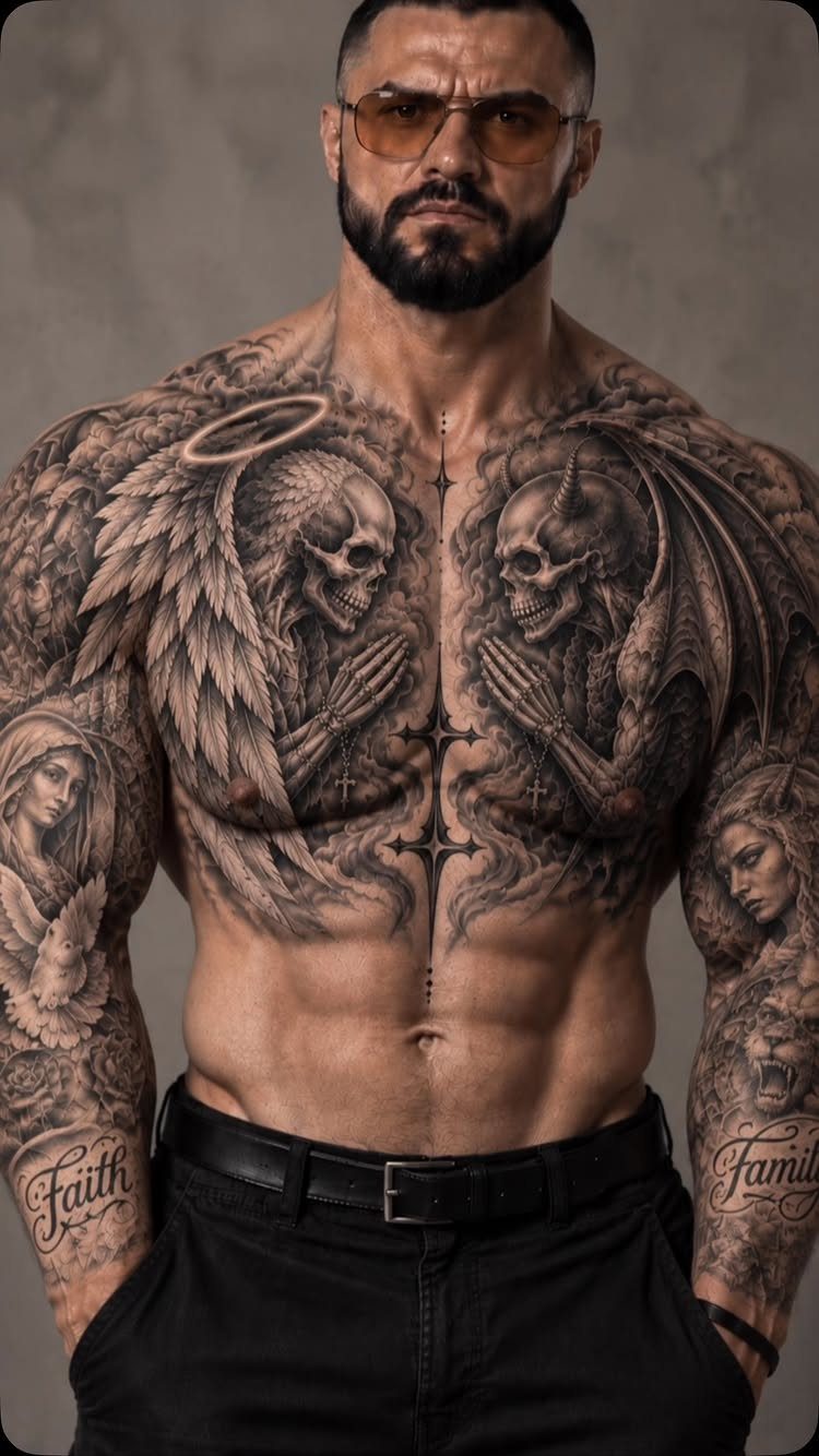
Angel skeleton facing demon skeleton across the chest reads as pure opposition stripped of softness. The bones remove any sentimentality; what remains is structure against structure.
This layout needs width.
A chest panel or full back gives the 2 figures room to stare each other down without crowding. Black and grey keeps the focus on anatomy rather than drama.
I would ask the artist to vary the bone density: angel ribs lighter, demon jaw heavier, something that lets you read which is which from across the room.


What You Will Get: The package comes with 5 sheets of Halloween temporary tattoos, including 4 pieces face tattoos, and 6 pieces black temporary tattoos, sufficient quantity for four people to use. Simply apply the tattoos to your face, neck, or arms for an instantly chilling appearance.

What You Will Get: The package comes with 3 sheets of Halloween temporary tattoos, including 2 pairs face tattoos, and 2 pieces bones temporary tattoos, sufficient quantity for two people to use. Simply apply the tattoos to your face, neck, or arms for an instantly chilling appearance.
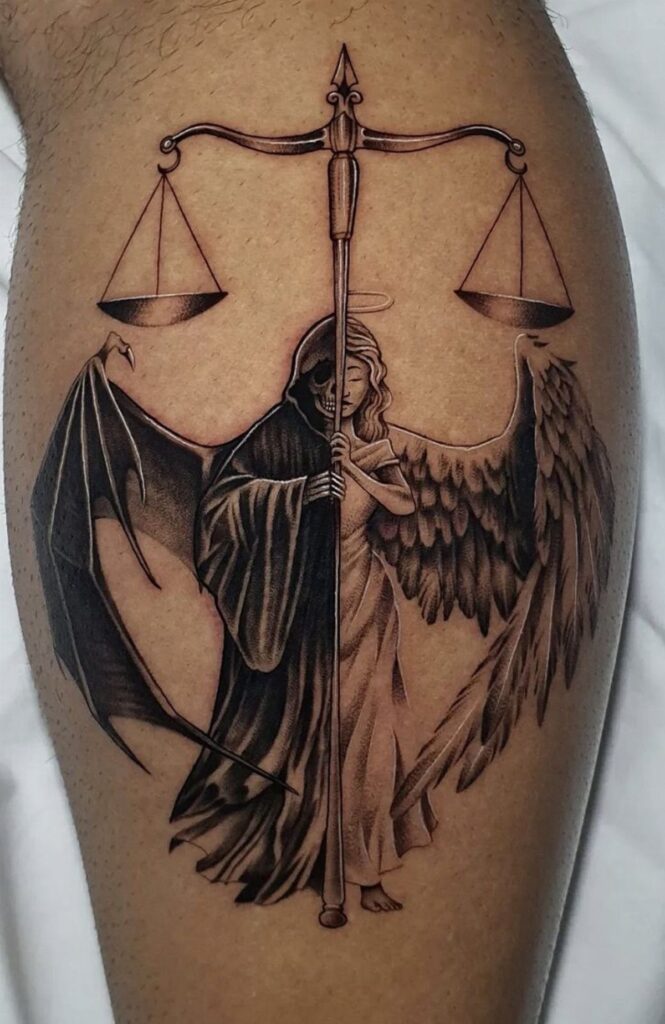
2. Scales of Justice
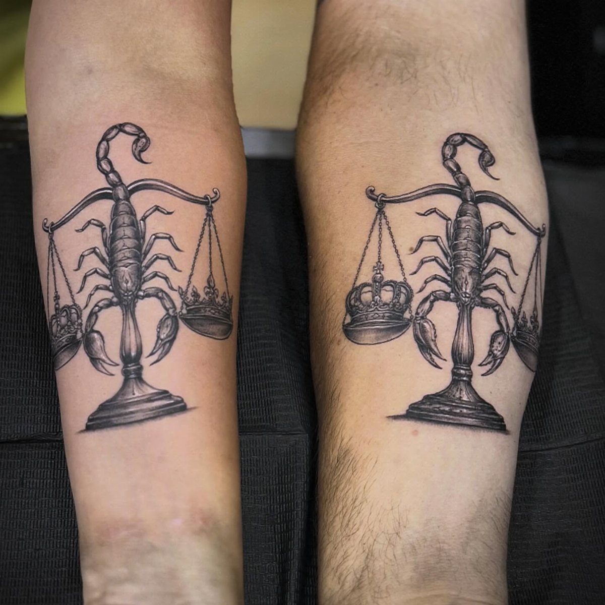
Scales with scorpion tails and crowns in the pans turn justice into something more personal than courthouse marble. The scorpions add stakes; the crowns suggest what gets weighed is power itself.
Forearm placement works because you see both arms together, matching. The balance reads only when the pair is side by side, so this commits you to bilateral symmetry or nothing.
Without figures, the symbolism stays abstract enough to shift meaning over years.
One day it is temptation against duty; another, ambition against restraint. That flexibility is the point.

🦂 Intricate & Striking Design: Features a highly detailed, monochrome scorpion design. The bold black lines and realistic silhouette create a cool, intimidating look perfect for expressing a bold personality.
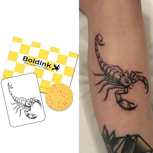
【Realistic Semi-Permanent Look】Boldink temporary tattoos are designed to look more like real tattoos than traditional temporary tattoo stickers. They are waterproof, smudge-resistant, and non-shiny for a natural-looking finish. The tattoo will appear silver at first and gradually darken into a rich, realistic color within 48 hours. For best results, avoid contact with bare skin, especially the face, and cover the tattoo with clothing while sleeping to prevent transfer.

Eye-Catching Design: Enhance your Halloween look with our Gold Snake Scales Tattoo Stickers, specifically designed to add an exotic and unique flair to any costume, ensuring you stand out at parties and events
3. Angel and Demon Playing Chess Tattoo
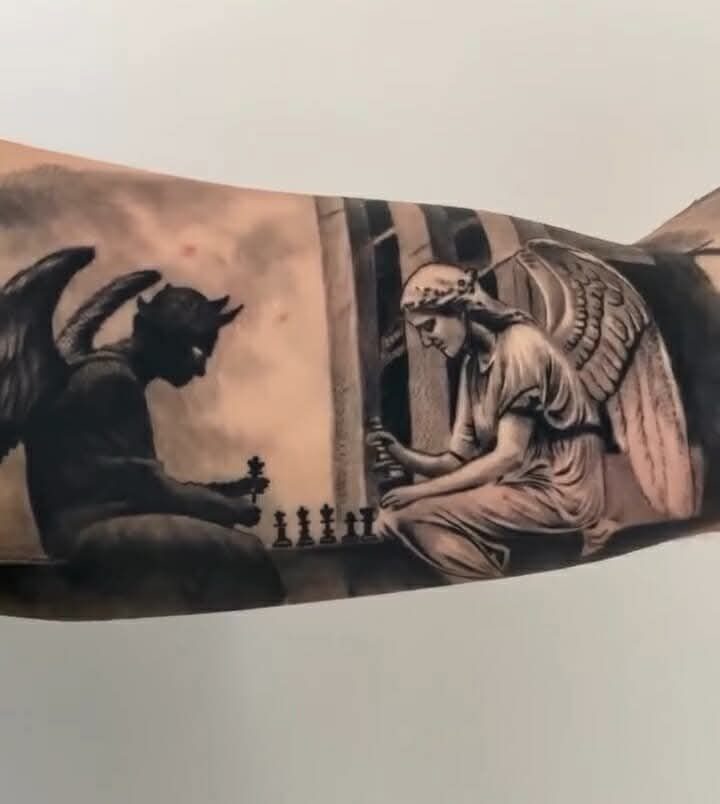
Chess between wings turns the struggle into patience and position rather than clash. The board matters as much as the players; someone chose to freeze the game mid-move.
Cloud background is common in the reference material but not required. What sells the idea is the posture: leaning forward, hands on pieces, neither side victorious yet.
A full sleeve gives space for the board’s geometry.
Without that real estate, the pieces shrink to illegibility. Budget for multiple sessions; the line work is dense and mistakes show.

Looks Real and Seamless -- 92% nylon and 8% spandex,stretchable fabric material,These arm tattoo sleeves is easy slip on and off,you can feel comfortable and soft whenever you wear it. Reasonable price with great quality.

★【92% nylon and 8% spandex】stretchable fabric material, easy slip on and off temporary tattoo sleeves for men

One Size Fits Most People, Measurement is approximately 15.4 inch long by 3.2 inch wide when not stretched. Unless you have really huge arms, these should fit comfortably because they are stretchable.
4. Fallen Angels
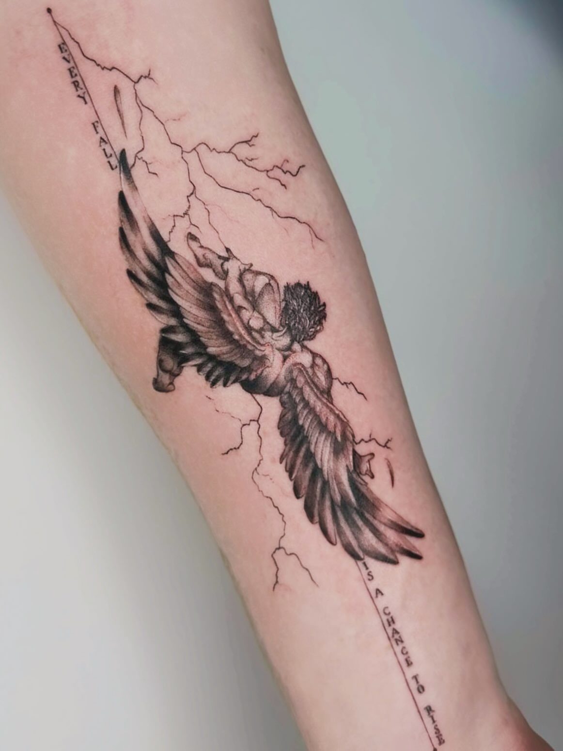
A falling figure with lightning and a line about rising frames the fall as necessary, not final.
A fallen angel tattoo works best when the wings still show their original span, broken but not reduced to stubs; the loss is in the posture, not the architecture.
The lightning needs contrast to read.
In black and grey, that means negative space or skin-breaks for the bolts. Too much fill and the strike disappears into shading.
This suits someone who has lived a visible failure and wants the mark to mean recovery, not only damage. The quote locks that in; without words, the meaning stays open.

【Unique & Artistic Designs】All UBICA tattoo designs are uniquely created by our talented in-house designers. With a wide range of styles—from bold to minimalist—there’s something for everyone. Each temporary tattoo stickers is a work of art, thoughtfully crafted to meet the highest standards of creativity and quality.

Halloween Face Tattoos: You will get 2 sheets Black Angel Face Tattoos and 2 sheets white Angel Face Tattoos for Kids Adults, in 2 different designs. Our Angel Face Stickers are most suitable for festival, Halloween, or Christmas.

FALLEN ANGEL ICARUS DESIGN: Featuring a masterpiece drawing of the mythical Icarus falling with detailed wings and fine line renaissance style body shading, this digital hand-drawn tattoo merges classical greek mythology with abstract geometric sun rays and alignment circles for a unique fine art look.
5. Yin-yang Design
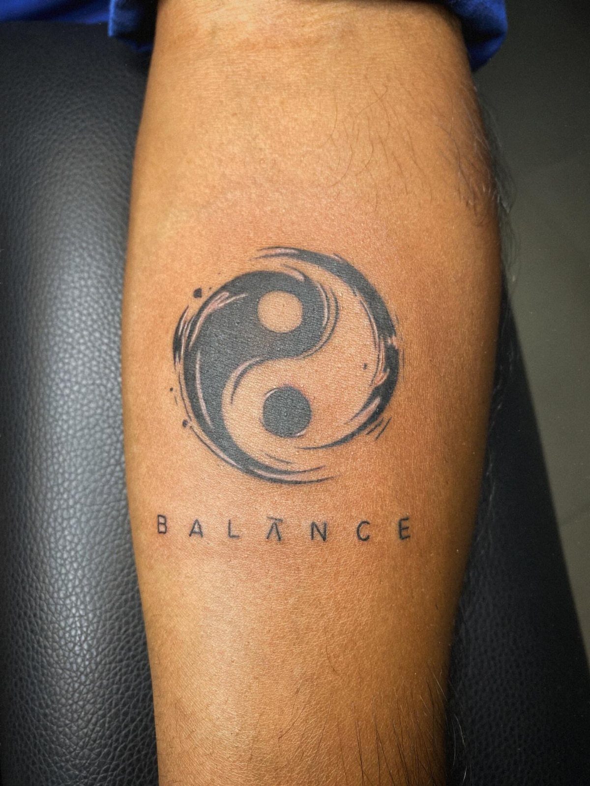
Brushstroke yin-yang with "BALANCE" underneath keeps the symbol from floating as pure philosophy. The word anchors it to a daily reminder.
The style here is key: loose ink, almost calligraphy, not the tight circle from a stencil. That softness lets it sit on a forearm without looking like a logo.
I would place it where I could see it during conflict: inner wrist, forearm inside face. The yin-yang is old enough to feel permanent; the brush treatment keeps it from feeling borrowed.

✅Premium Skin-Like Practice : Crafted with high-density synthetic leather, our tattoo practice skin mimics human skin’s elasticity and texture. Ideal for shading, outlining, and microblading drills, the ultra-soft surface ensures realistic resistance for needle control. Durable and reusable—perfect for beginners mastering techniques or pros testing new inks/machines.

Double Sided Tattoo Practice Skin: easy wipe, 2 sides designed fine line tattoo practice skins feature over 20 different stencil designs.

VALUE PACKAGE - The 20Pcs Tattoo Practice Skins 3MM with Transfer Paper Kit includes 15Pcs 11*8.5 inch Stencil Paper and 5Pcs 7.5*5.6 inch Double Sided Thick Blank Tattoo Fake Skin 3MM. The best combination of tattoo skin and tracing paper to help you save time and get a great deal.
6. Holy Figure and Demon Portrait
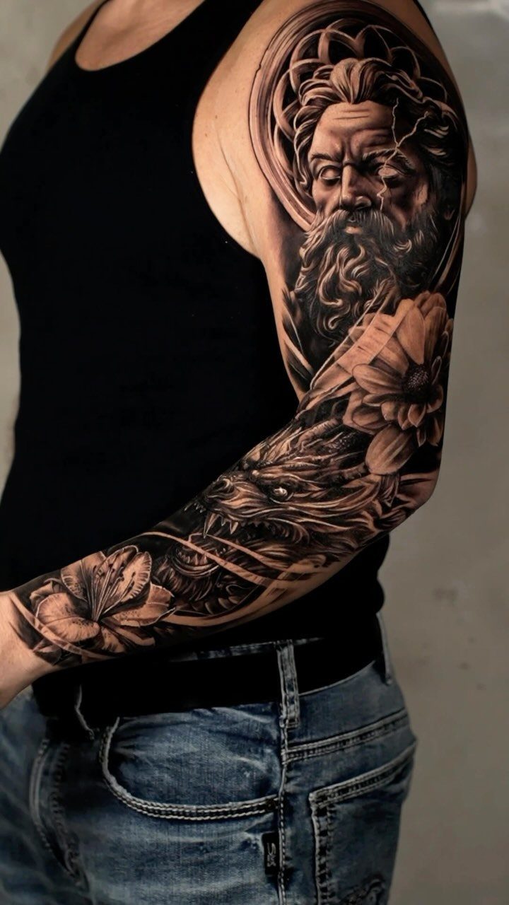
Bearded holy figure with halo against snarling demon face packs a sleeve with readable contrast at every angle. The beard and halo identify the side; the snarl does the rest.
Flowers between the figures soften the transition more than a hard split would. That middle ground matters in a sleeve you live with; pure horror wears thin faster than tension does.
Realism at this density takes a specialist. The skin texture on the demon, the individual hairs in the beard: these separate competent work from work that holds up when someone leans in close.

Realistic Skeleton Hand Designs – Set includes 4 sheets with mirrored left and right hand bone art for ultra-creepy Halloween transformations.

SIZE - 82 sheets temporary tattoos, over 200+ beautiful designs, size is 8.1*3.7 inch 12 sheets, 4.1*2.4 inch 70 sheets. With colored tattoos, black tattoos, fake tattoos for men, tribal tattoo and skull tattoos, there are a large selection of tattoos for you to change it at any time/ any moment, used for arms, shoulders, back, legs and any other part of your body.

Spooky Skeleton Face Tattoo: Transform your Halloween look with our realistic skeleton face tattoos. Perfect for any Halloween costume, these skull face tattoos are ideal for those wanting to make a bold, spooky statement.
7. Light and Dark Winged Figure
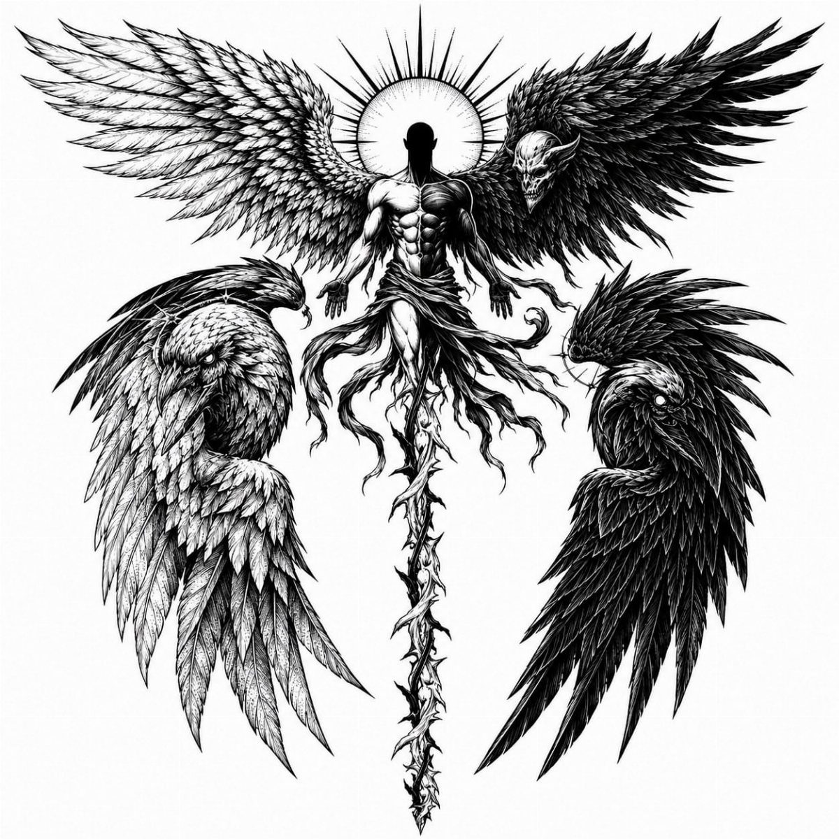
Split wings on a single figure read as internal conflict made visible. The birds below mirror that split, so the design repeats its question rather than answering it.
Black and grey ink keeps the contrast about value, not temperature; a warm wing and cool wing would turn this into temperature play, which is a different piece entirely.
The illustration style means clean lines throughout. Stippled shading holds detail at small sizes better than smooth gradients, and a winged figure has feathers enough to lose.
I would check that the central figure’s musculature still reads after the wings divide the torso. Too much wing and the body becomes a hinge.

Realistic 3D Design: Experience lifelike scorpion temporary tattoos with intricate details and vibrant colors for a striking appearance.

Includes: 1 Large Tattoo

8. Crown and Screaming Demon
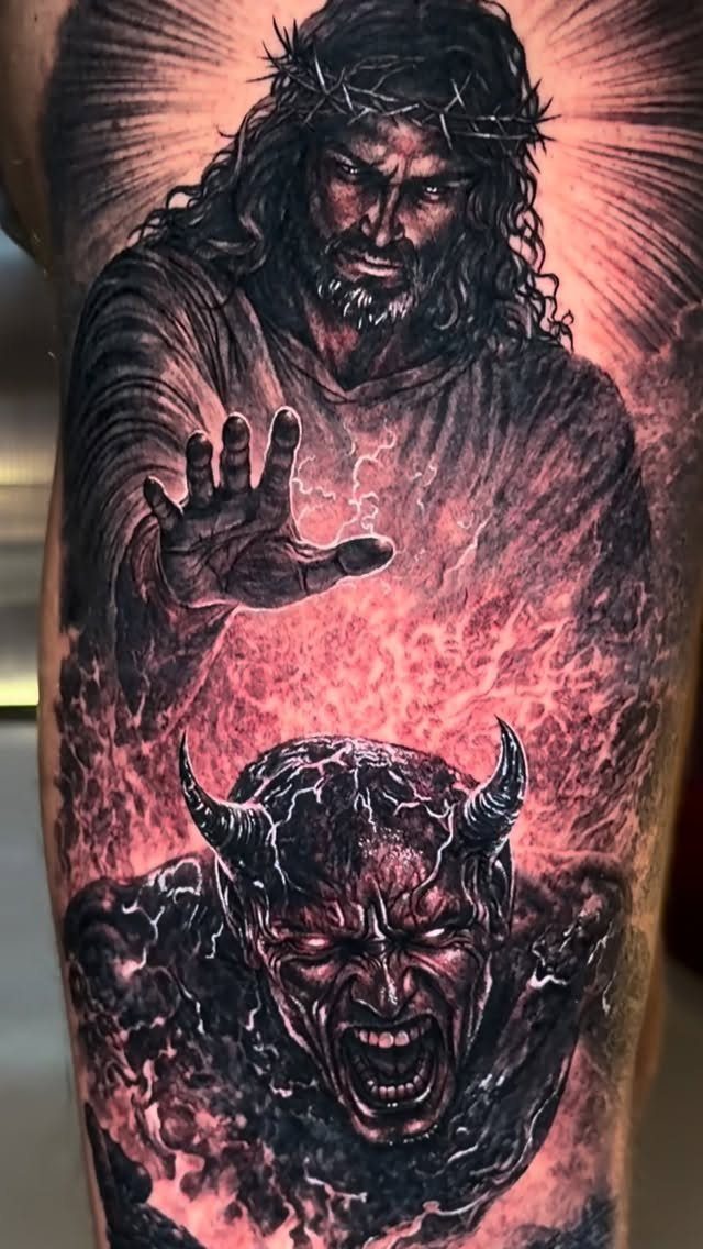
Red glow against black and grey turns the crown into a light source rather than an ornament. The color is doing active work: it separates divine from demonic without requiring the viewer to parse faces first.
Black and red ages faster than black and grey.
The red will need touch-up if you want that glow to stay urgent rather than muddy. Plan for it.
The reaching motion needs space to extend.
A forearm limits the gesture; a calf or outer thigh lets the arm stretch and the demon recoil. I would put this where the crowned figure sits above the demon, literally, so gravity helps the story.

Material and Size: crafted from fabric, these tattoo sleeves a skin-friendly experience for all users; Designed for men, the arm sleeve tattoo fits snugly at 18.11 inches/46 cm, plus size is suitable for those with wide arms, while one size is for regular arms, comfortable fit that feels natural on your skin

Looks Real and Seamless -- 92% nylon and 8% spandex,stretchable fabric material,These arm tattoo sleeves is easy slip on and off,you can feel comfortable and soft whenever you wear it. Reasonable price with great quality.

Looks Real and Seamless -- 92% nylon and 8% spandex,stretchable fabric material,These arm tattoo sleeves is easy slip on and off,you can feel comfortable and soft whenever you wear it. Reasonable price with great quality.
Frequently Asked Questions
What does a good and evil tattoo symbolize?
It symbolizes the internal split between moral righteousness and temptation, or ambition and restraint, depending on how the design is built.
The same design can hit differently at thirty than it did at twenty because the symbols stay open enough to grow with whoever wears them.
Which tattoo to avoid?
Some designs carry risks worth weighing before you commit, and a few of them come up again and again in shop talk.
Red ink fades faster than black, so a crown and screaming demon in black and red will need more upkeep to keep that urgency; black and grey holds its line longer.
Pure horror without tension, like a hard split between holy figure and demon rather than flowers in the middle, wears thin faster in a sleeve you see daily.