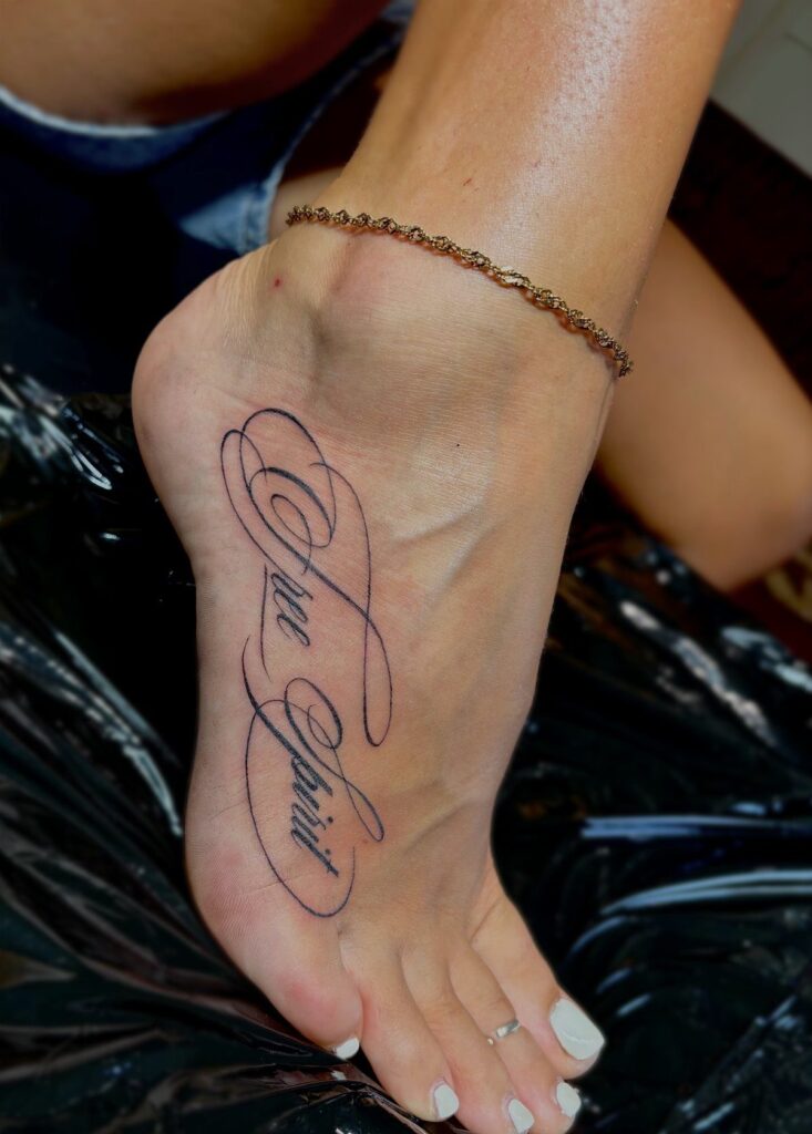
The spots below run from easy to hide to hard to miss, and the right one depends on whether you want the words as a private reminder or something you show daily.
I have watched artists spend extra time stretching the ribcage flat; the spot rises and falls even when you hold your breath.
[link-whisper-related-posts]1. Script Tattoo Along Side of Ribcage
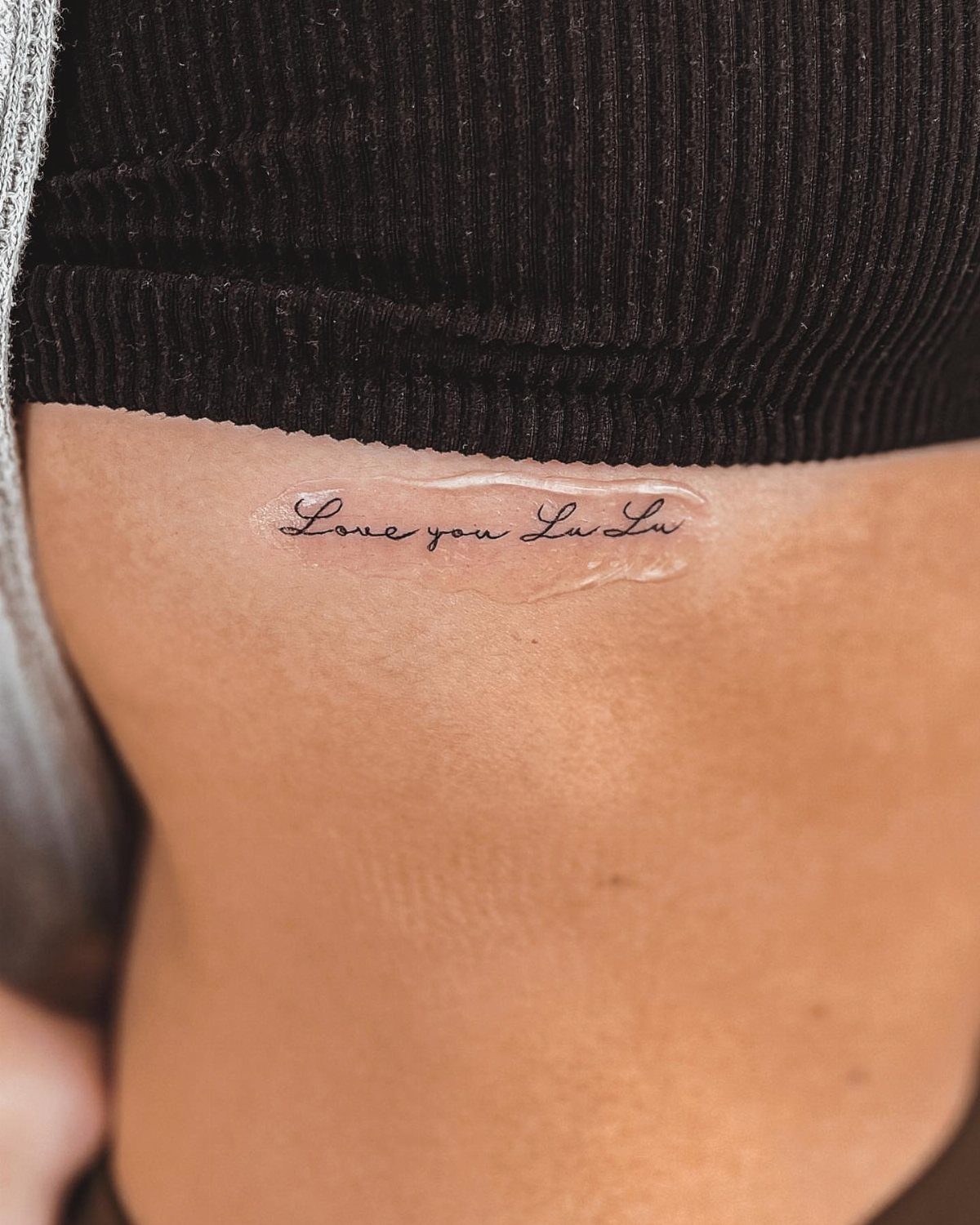
Ribcage script sits where only you and whoever you choose see it, which makes the wording matter more, not less.
Fine line cursive runs vertically along the floating ribs or turns horizontal beneath the bra line, and either way the skin there moves with every breath.
I have watched artists spend extra time stretching this spot flat; the ribcage rises and falls even when you hold your breath.
Black ink holds best here, color drifts. Plan for a longer session than the size suggests, and expect to sleep on your opposite side until the skin settles.

Clean, Flawless Transfers: Your artwork will look so clean once transferred to the skin with the Stencil Stuff gel! Gentle on the skin, Stencil Stuff transfer solution helps you achieve clear and sharp tattoo stencil transfers every time!

Safe and Healthy: Our tattoo transfer gel meets strict safety and non-toxic material standards, non-irritating to the skin and vegan-friendly. Maintains client comfort while achieving clear tattoo stencil transfers.

🛡️ SAFE AND GENTLE FORMULA - Our tattoo goo is made from skin-friendly, plant-based ingredients that are non-toxic and non-irritating, ensuring gentle use on all skin types during stencil transfer.
2. Script Tattoo on Upper Hip
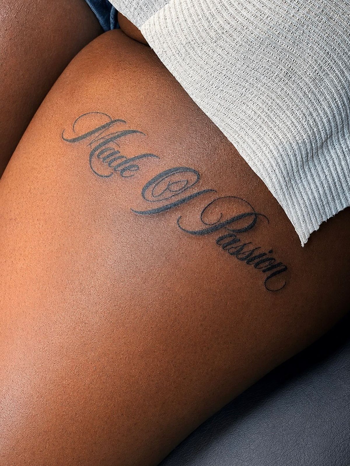
Upper hip placement hides under a waistband until you want it seen.
Horizontal cursive just above the belt line follows the natural fold, though I would ask the artist to place it slightly above where your everyday pants sit, not right at the crease.
The upper hip is a great placement for script tattoos because it works for longer phrases that would crowd a wrist or forearm.

6 Pack of Surgical Skin Markers. Individually Sealed, Sterile.

Multiple uses: the 2 tip marker skin pens size are 0.5 mm and 1 mm; The thickness of the pen tip can easily draw accurate and clean lines, suitable for experienced or beginners

QUALITY TATTOO MARKERS FOR SKIN: Our tattoo markers are designed for precision, offering bold, clear lines on the skin. Ideal for sketching, freehand drawing, or tattooing, they serve as reliable skin markers for tattoos, ensuring quality results every time.
3. Script Tattoo on Inner Wrist
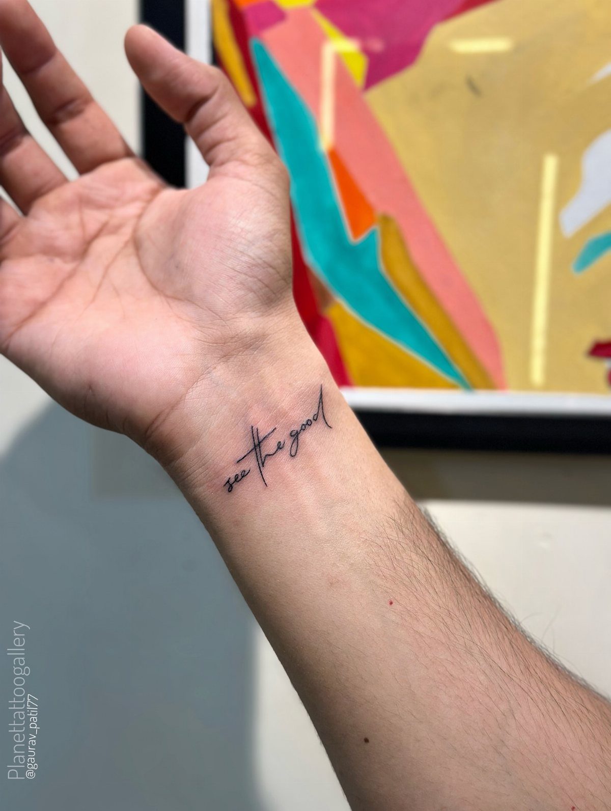
Inner wrist script is the first tattoo many people get, and the visibility is the whole point.
Fine-line cursive script centers on the inner wrist where the veins show, which means the artist works around blue lines that sit close to the surface.
The bone underneath makes this spot sharper than fleshy areas, though the session is over fast.
I have seen this placement age poorly when the text runs too small, 8-point font does not hold at wrist scale. Plan on touch-ups, and know that some employers still glance at this spot.

171 PCS Different Styles Halloween Tattoos Stencil: Our hallloween temporary tattoo stencils sheet comes with 171 different hallloween design such as pumpkin lamps, black cats, skulls, wizards, witch hats, ghoost, witch, Spider Web, Skeleton more halloween Style in 12 sheets A5 size. Perfect for couple halloween party and decoration.

【 575+ Fun Assorted Tattoo Stencils 】-The ChurlChurl tattoo stencils collection includes 575 high quality stencils with multiple themes. enjoy cute trendy tattoo stencil designs like butterflies, words, flowers, symbols, totem, Egypt style patterns and more.

183PCS Different Styles Tattoos Stencil: Our temporary tattoo stencils forkids comes with 183 temporary tattoo stencils painting set design such as flowers, cats, hearts, skulls, dinosaurs, fruits, deer, scorpions, Hannah, unicorns, whales, cars, rainbows, telescopes, ships, too fast, astronauts, pirates, letters, stars and more Style in 12 sheets A5 size. Perfect for festivals, parties, or daily fashion.
4. Script Tattoo Along Collarbone
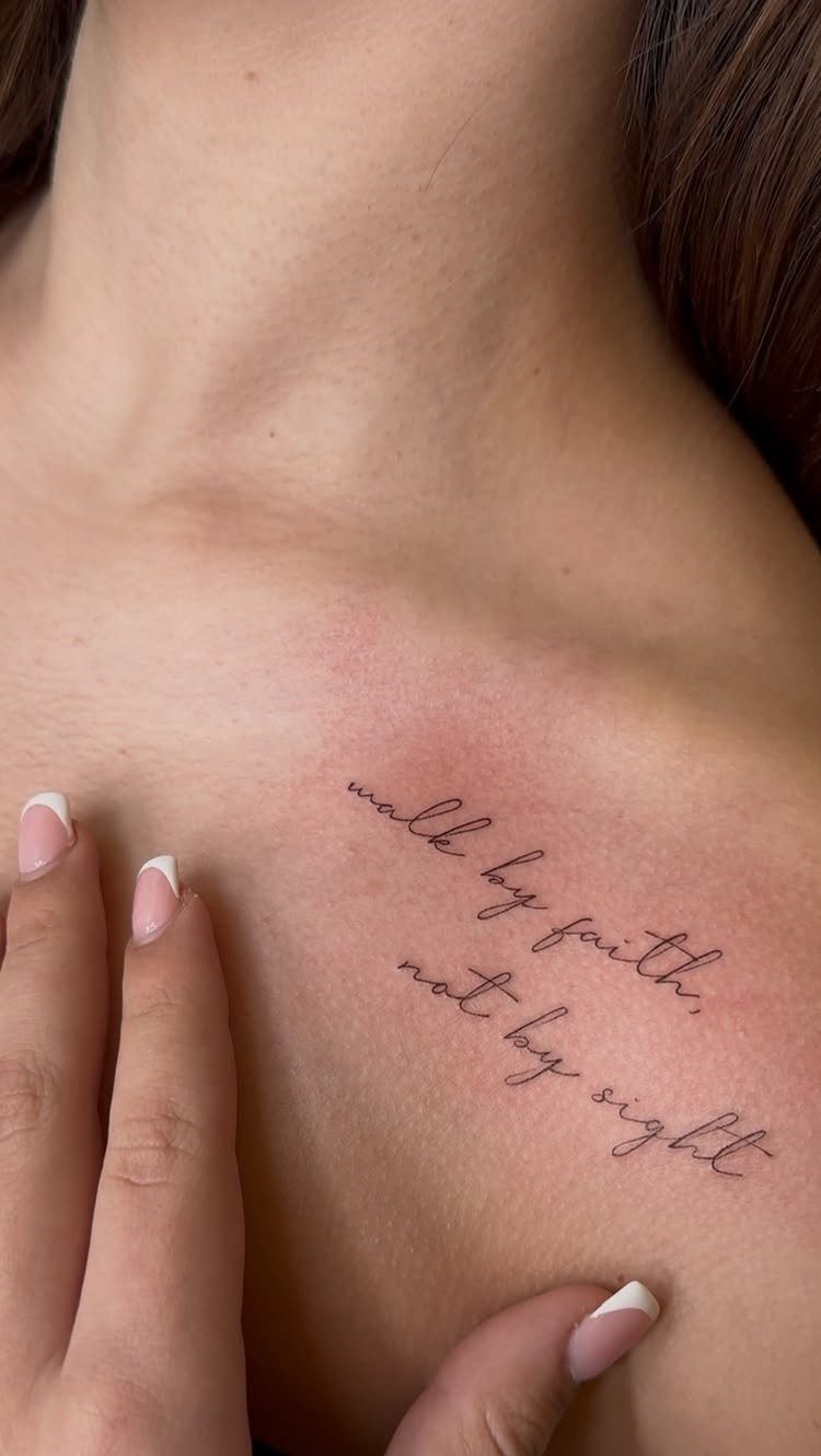
Collarbone script follows the natural curve beneath the bone, not on top of it where the skin shifts most. The flat plane between shoulder points holds more words than a wrist, which is the surprise of this placement.
Black ink cursive softens the edge of the bone underneath. I would avoid this for a first tattoo; the needle noise near your ear and the chest vibration unnerve some people more than the sensation itself.

[Tattoos Stencils Kit]: 24 sheets, each sheet including 4 patterns total 96pcs tattoo stencil. Which featuring Playing card patterns, flowers, lizards, scorpions, rabbits, spiders, butterflies, geckos, small birds, insects, hearts, stars, abstract and tribal motifs and more tattoo designs, enough quantity and different pattern for you create your style.

Package Includes: You will receive 20 sheets reusable tattoo stencils, enough quantity to meet your daily requirements. The mehndi stencils are suitable for airbrush painting, glitter tattoo, and so on.

【 What's included 】- 12 pages of unique and strong adhesive tattoo stencils, (no pigment included): (including 12 A4 patterns sheets) Almost unlimited creative combinations and options to meet your every need.
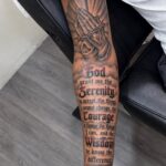
5. Script Tattoo on Inner Forearm
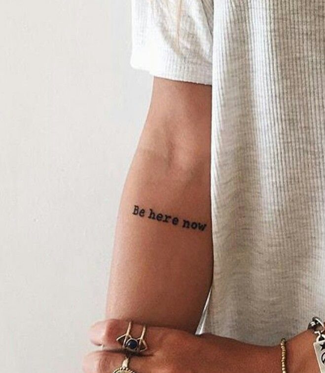
Inner forearm script sits where you read it yourself, which changes what people choose to write.
Horizontal placement on the inner forearm keeps the text right-side-up to the wearer, a small kindness that matters if the words are meant as a reminder. The flat muscle here makes for clean lines and straightforward healing.
Typewriter fonts hold their edges better than cursive in this spot if you work with your hands, the straight lines blur less than loops. This is one of the easier cover-up locations if you change your mind later.
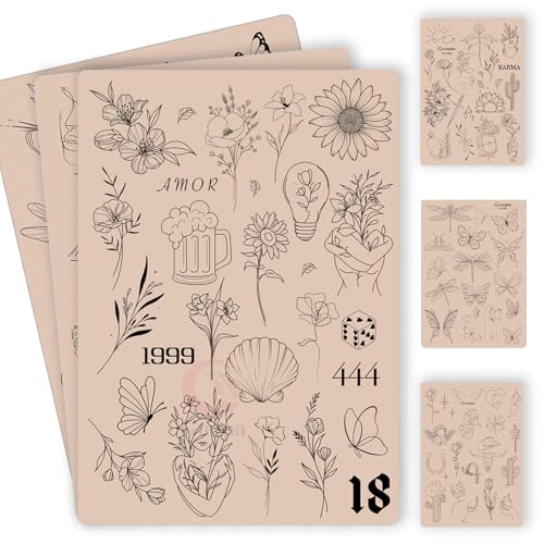
100+ Pre-Printed Designs – Features a wide variety of fine line and tiny tattoo stencils to enhance detailing skills.

142+ Nature-Inspired Tattoos Stencil Designs in 12 Sheets: This temporay tattoo template set features over 142 unique, delicate designs centered on enchanting botanical and natural elements. Discover a vast collection of flowers (daisies, roses, sunflowers, lavender), intricate leaves, winding stems, complete bouquets, elegant wreaths, crowns, bees, and butterflies. Perfect for creating floral temporary tattoos, henna-inspired patterns, and nature-themed body art.

Double Sided Tattoo Practice Skin: easy wipe, 2 sides designed fine line tattoo practice skins feature over 20 different stencil designs.
6. Script Tattoo Along Back of Arm
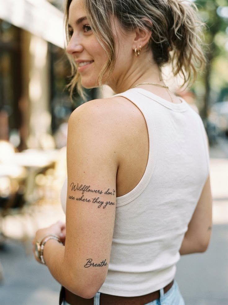
Back of arm script turns the body into a canvas you never fully see yourself. Vertical cursive running from shoulder to elbow follows the long muscle there, using the full length for a line that would wrap awkwardly anywhere else.
I like this placement for words meant for other people to read as you walk away, or for text you want to feel more than check daily.
The outer arm tans and sunburns evenly with the rest of you, which helps long-term readability more than people think.

Fast & Long-Lasting Crisp Lines: The 100ml MIUXIA tattoo stencil gel creates sharp lines, capturing every detail of your artwork. It sets in minutes, forming a smudge-resistant layer, avoiding fading and blurring during long tattoo sessions and frequent wiping.

【Safe 】: Our tattoo transfer gel meets strict safety and non-toxic material standards, non-irritating to skin, vegan and skin-friendly, and allows clear, clean tattoo transfer.

Locks your Stencil in Place - Nothing is more frustrating than having your tattoo stencils rub off! Electrum tattoo stencil transfer gel was designed by a group of veteran tattoo artists to create dark, bold transfers that last a long time.
7. Script Tattoo Across Lower Back
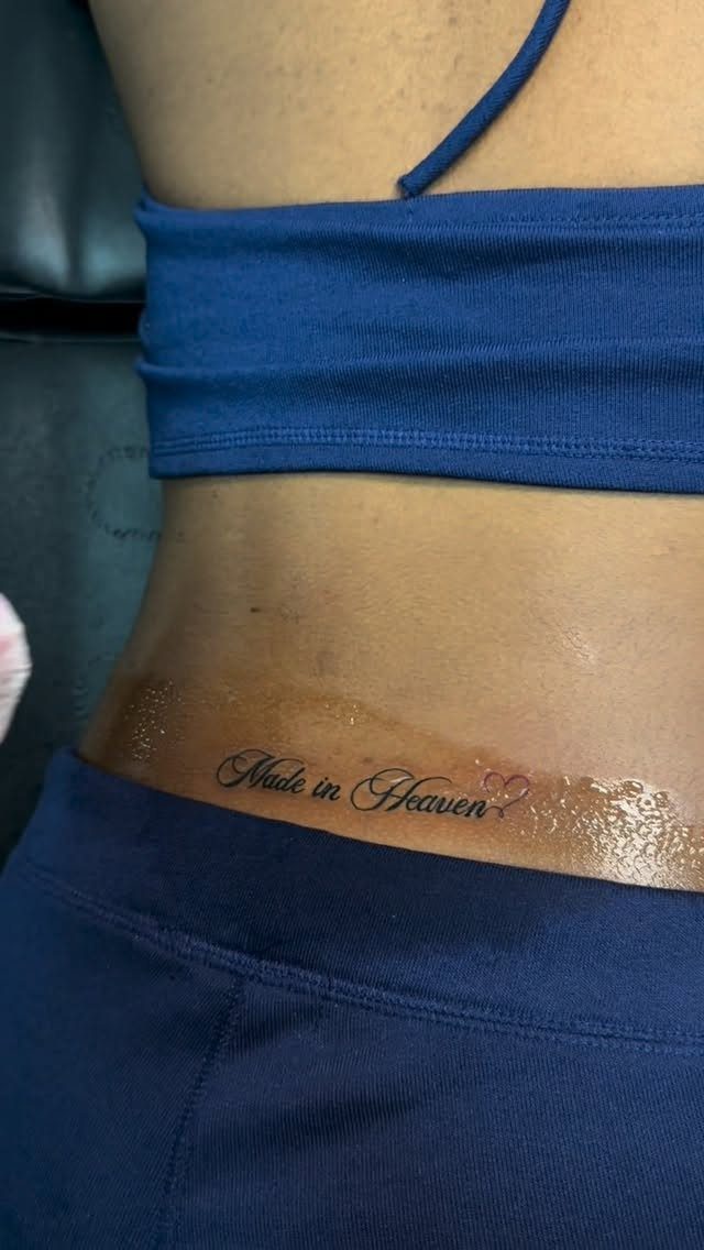
Lower back script still carries a reputation from the tramp-stamp era that makes some clients hesitate.
Horizontal placement across the center works because the skin there stays relatively flat when you stand, though sitting folds the area and complicates early healing.
Fine line cursive with elongated flourishes fits the width better than block letters, which read as a strip rather than a line.
I would keep the text below the pant line unless you want it visible; waistbands rub and fade ink faster than people expect.
This spot tans unevenly if you swim or sunbathe, so plan on sunscreen or accept that the black will warm to gray over time.

Body art is at your fingertips with Skin Markers. Create vibrant temporary tattoos to complement cosplay outfits, Halloween costumes or just for fun. Includes easy-to-use stencils. Temporary tattoo markers includes 15 skin-safe body art pens and 82 temporary tattoo stencils.

2 TIPS IN 1 PEN FOR PRECISE MARKING — Each tattoo marker features a 0.5mm fine tip and 1.0mm medium tip, giving artists two line widths in one pen. Use the fine tip for detailed stencil outlines and precise placement, and the medium tip for clearer guide marks and larger areas.

PRACTICE SKIN BOOK DESIGN – NO MORE LOOSE SHEETS Unlike ordinary loose fake skin sheets, NEDPAIN combines 10 silicone tattoo practice skins into a portable flip-book design with a durable hardcover and separator sheet. Stay organized, practice anywhere, and keep your designs neatly protected.
8. Script Tattoo on Thigh
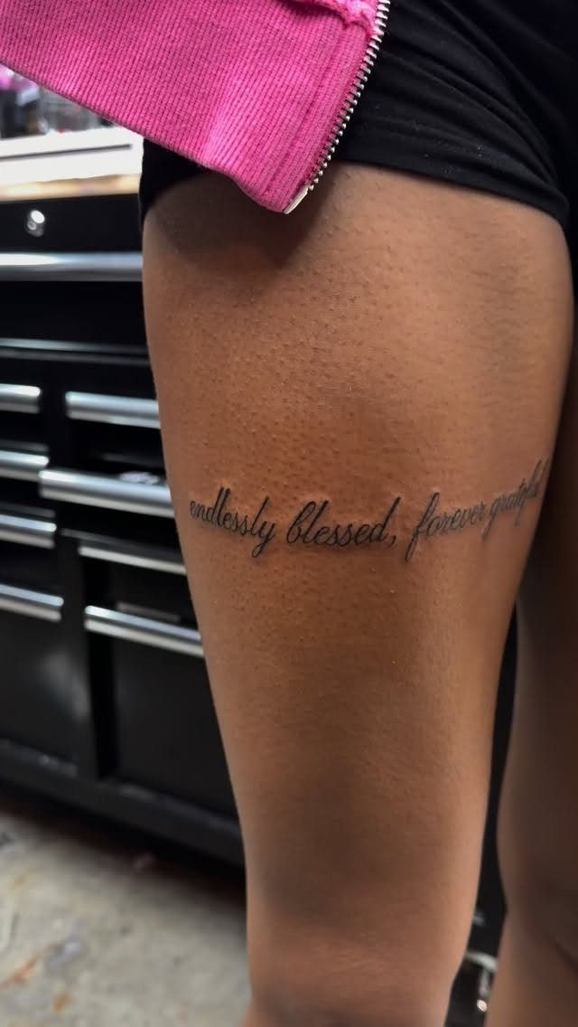
Thigh script gives you the most room for a phrase that actually means something, not an abbreviation squeezed into a smaller space.
Cursive runs well along the outer thigh or sits centered on the front, and the muscle underneath keeps the line steady while the artist works.
A thigh gives a longer phrase room to sit flat instead of wrapping awkwardly around a smaller curve. Black ink is standard, though I have seen red cursive here that reads bolder against pale skin.
The thigh hurts less than bone-adjacent spots, which matters if you are budgeting for a longer session with more words. Healing stays straightforward if you avoid anything that rubs tight against the skin at first.

▶ Henna Tattoo Kit: 16 sheets tattoo stencils. airbrush tattoo stencils suitable for tattoo lovers. Experience the effects of tattooing without the pain of tattooing.

⯁ 400+ Reusable Henna Stencils: Get 24 sheets of high-quality, self-adhesive hollow templates featuring over 400 unique patterns. These temporary tattoo stencils allow you to create stunning body art including mandalas, butterflies, and dragons. Perfect for practicing techniques without permanence

VARIETY OF OPTIONS - This set of temporary tattoo stencil includes 262 different theme patterns. butterfly, mermaid, flower,pirate,animal,shark,crown, dinosaur etc daily kid’s favorite design, also have like as pumpkin, spider, bat, skull, snowflake, etc Halloween, Christmas festive Style in 14 pages A4 size.
9. Script Tattoo on Nape of Neck
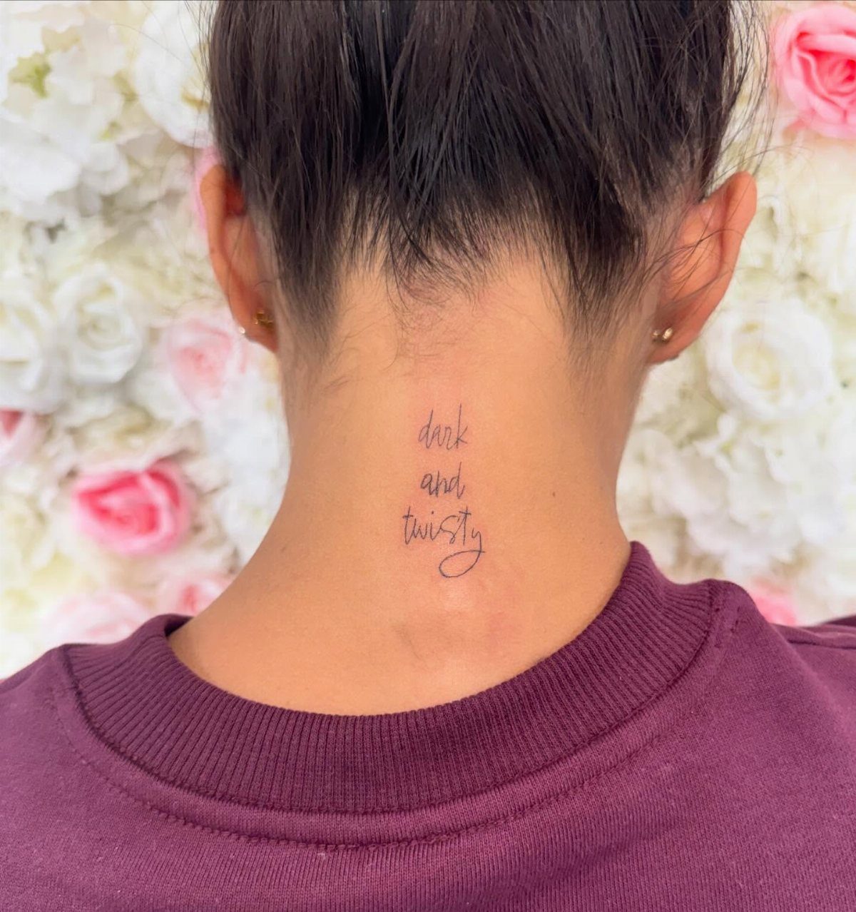
Nape of the neck script hides under hair when you want and shows when you tie it up, which gives the wearer control a wrist or forearm never offers.
Small cursive centered on the spine, right where the skull meets the neck, stays readable because the skin there moves less than people assume.
The session is short, though the sound of the machine near your ears unsettles some clients more than the sensation itself.
I would check your workplace dress code first; this spot is easier to cover than a hand, harder than a shoulder.
Fine line black ink holds well here, but hair products and shampoo sting fresh work, so plan your wash schedule around the first week.

REUSABLD VARIETY OF OPTIONS - This set of temporary tattoo stencil includes 123 different patterns for adult,male. Scorpion tiger dragon cow eagle skeleton Tribal Symbols geometric design etc patterns in 20 pages A4 size, Almost unlimited creative combinations and options to meet your every need.

Diverse Design Selection: Explore over 80 unique stencil designs including butterflies, moons, numbers, shells, flowers, and more. Perfect for honing your skills in creating clean lines and appropriate shading.
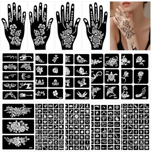
Set Combinations: Ncludes 4 hand tatouage (width 4.33 and length 8.22 inches), 243 pieces of tattoo stencils in 6 sizes there are small tattoo designs, medium tattoo designs and large tattoo designs. Meet your different possibilities! Temporary tattoo kit stencils for tattoo beginners.
Considerations for First Tattoos
First-timers tend to fixate on the design and treat placement as an afterthought. The order should reverse.
Choose a spot you can live with in every context you move through: job interviews, family dinners, the gym. Personal significance matters more when the words sit somewhere you see daily, not tucked away where they become scenery.
Pain tolerance is real but it is also temporary; visibility is forever. If you are unsure, the inner forearm or upper thigh let you cover or reveal with a single clothing choice.
Avoid the ribcage or collarbone until you know how your body handles the needle; the session length and the mental load of those spots surprise people. Start where the skin heals predictably and the meaning stays active in your sight.

32 Bold Animal Tribal Patterns – 4 large A4 sheets featuring Dragons, Wolves, Scorpions, Lions, and more, for a strong, edgy look with professional-quality stencils....
Pain Levels by Placement
The ribcage and collarbone sit on bone with thin skin layered over, which sends the sensation deeper and sharper than fleshy areas.
The wrist hurts less in total but the bone underneath makes it sting in a concentrated way; the session ends fast, which helps.
The thigh and upper hip carry more muscle and fat, so the vibration spreads and dulls. The back of the arm lands in the middle: muscle there, but the skin pulls when you move.
The nape is over fast, though the buzz that close to your skull rattles some people worse than the sting itself. Pain is not the only cost.
Long sessions on sensitive skin tire you out, and tired bodies twitch. Plan shorter appointments for spots you know will test you.
Tattoo Size and Design
Scale the text to the flat ground available, not to the phrase you wish would fit. The wrist and inner forearm reward restraint; a line that runs too long wraps and reads awkwardly from most angles.
The thigh and back of the arm give you length without that compromise, which matters for quotes or names you refuse to abbreviate.
The collarbone and lower back fit wider layouts than people assume, though the lower back folds when you sit and stresses any design that spans the center.
Match the weight of the line to the skin: thin for stable areas, slightly heavier where the body moves most.
Frequently Asked Questions
What is the 1/3 rule tattoo?
I have not found a reliable 1/3 rule that tattoo artists actually use for sizing or placement; most shops eyeball proportion against the body part instead.
What’s the most painful tattoo placement?
The ribcage and collarbone hurt most because bone sits right under thin skin, which sends the sensation deeper and sharper than fleshy spots.
The wrist concentrates the sting because the needle rattles against bone so close to the surface, though a small script piece there rarely takes more than twenty minutes.
Where is the best place to get a script tattoo?
The inner forearm, upper thigh, and upper hip work best for most people because they offer flat ground, predictable healing, and the option to cover or reveal with one clothing choice.
Ribcage and collarbone placements carry more pain and longer mental load, so I would save those for later tattoos.